
Compositional Balance: Using Visual Weight with Purpose
Updated 12 Oct 2026
Lesson 32 · Restraint
Choose the relationship between visual weights
Compositional balance concerns how attention is distributed across a photograph. Size, brightness, colour, detail, position and meaning all influence the visual weight of an element.
A settled arrangement may express stillness. Unequal weight may create tension or make one area deliberately dominant. Consider what the relationship contributes before deciding that it needs correcting.
Restraint includes resisting the urge to add a counterweight. A change of viewpoint, different spacing or an omission may be more useful. Sometimes the existing arrangement already expresses what matters.
Three things to take from this lesson
Notice visual weight
Look at which areas attract attention and how they relate across the whole frame.
Compare stability and tension
Explore a settled version and one that allows greater dominance or imbalance.
Change only with a reason
Consider omission and viewpoint before adding another element. Keep the arrangement that serves your intention.
Where this lesson fits
Notice what draws your attention, recognise what you want to communicate, then choose the tools that support it.
SEE → FEEL → TECHNIQUE
- Intention
- Restraint · this lesson
- Observation
- Judgement
Restraint
What can I leave out?
Assess the distribution of attention before adding or correcting anything. Space, stability and deliberate imbalance can all serve the image.
Video 2 · Restraint
- Lesson 30 — Negative Space
- Lesson 31 — Contrast
- Lesson 32 · Compositional Balance — you are here
The four themes work together throughout photography. Return to any of them whenever it helps you reconsider a choice. The video groups connect related lessons; the Academy’s numbered route stays the same.

⏱️ CHAPTERS
00:00 - Introduction: Composition with Restraint
01:21 - Lesson 30: What Is Negative Space?
02:24 - Active Space: Sky, Water and Horizon Decisions
03:17 - How Much Space Do You Need? (In-Field Comparison)
04:49 - Three Rules for Using Negative Space
05:16 - Lesson 31: Contrast - Tone, Color and Texture
06:34 - Low Key vs Contrast
07:05 - Testing Contrast: How Much Is Enough?
08:19 - Three Rules for Contrast and Separation
08:52 - Lesson 32: Compositional Balance and Visual Weight
09:25 - Symmetry vs Asymmetrical Balance
10:40 - The Golden Ratio and Phi Grid Overlay
11:45 - 5 Factors That Control Visual Weight
13:20 - Three Rules for Compositional Balance
13:47 - Space, Contrast and Balance: The Practical In-Camera Challenge
Table of Contents Show
Visual weight · expression
Balance begins with what you want to express
Look at where attention gathers and how those areas relate. A small face, bright mark or isolated shape may attract attention beyond its physical size.
Visual weight depends on the whole frame and on what its elements mean to the viewer. Before changing the arrangement, identify the effect you want to preserve.
Choose the relationship
Stability, tension and deliberate dominance are all available choices. A photograph does not need to distribute attention evenly to work.
Use symmetry with purpose
Mirrored forms can create order, directness or stillness. An interruption changes that relationship, but perfect symmetry does not need breaking simply to avoid appearing static.

Symmetry · Repetition · Visual order
Use symmetry and repetition deliberately
Symmetry can create stillness, clarity, formality and order. It appears when visual elements mirror, rotate or repeat in a recognisable relationship.
A symmetrical photograph does not succeed merely because both sides match. The arrangement must also support the subject, mood and meaning you want the image to communicate.
Three forms of symmetry to look for
Reflection symmetry
One side mirrors the other across an axis. Water, glass, polished floors and reflective buildings can produce this relationship. The axis may be vertical, horizontal or diagonal.
Rotational symmetry
Elements radiate or turn around a central point. Flowers, wheels, staircases and circular architectural details often reveal this type of visual order.
Translational symmetry
A shape or structure repeats across the frame. Windows, columns, fence posts and patterns can create rhythm without requiring the two sides of the photograph to mirror exactly.
Compose symmetry with purpose
Choose the axis and viewpoint
Move until the relationship is clear. A central viewpoint can make symmetry feel direct and deliberate, while a slight change of position may introduce perspective or reveal competing shapes. Check that the frame edges support the pattern rather than cutting it awkwardly.
Compare visual weight
Equal spacing does not always create equal visual weight. A bright highlight, face, saturated colour or detailed area can attract more attention than a larger, quieter shape. Compare both sides of the frame and decide whether the distribution feels stable or deliberately tense.
Use lines, repetition and depth
Corridors, paths and architectural lines can lead towards a central point. Repeated foreground and background elements can also extend the symmetry through depth, giving the photograph structure beyond a flat left-and-right comparison.
When should you break symmetry?
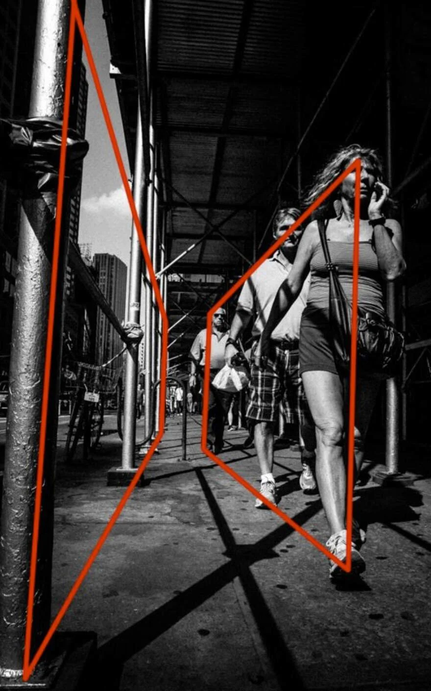
A person, gap, shadow or isolated object can interrupt an otherwise ordered arrangement. This may introduce movement, tension or a clear focal point. It is useful when that change strengthens the subject or helps express the moment.
Do not break symmetry simply because a centred photograph might appear conventional. If the uninterrupted arrangement creates the calm, precision or formality you want, it may be the strongest version. When possible, photograph both arrangements and compare their effect.

Reflection symmetry creates a settled relationship across the horizontal axis, while the darker island and mountain forms prevent both halves from carrying identical visual weight.
Asymmetry · Visual weight · Tension
Use asymmetry and deliberate imbalance
An asymmetrical photograph uses unequal forms, numbers or positions. It may still feel visually balanced, or it may retain a useful tension.
Neither outcome follows automatically from placing the subject off-centre. Judge the combined effect of every element and the space between them.
What creates asymmetrical visual weight?
Size and number
One large form may relate to several smaller ones. Their importance also depends on the subject and the surrounding frame, so physical size alone does not determine their weight.
Tone, colour and detail
A small bright highlight, saturated colour, face or detailed texture may attract more attention than a larger, quieter area.
Position and space
An isolated element near an edge can feel prominent. Empty or quiet space may counterweight it, increase its isolation or become an important part of the photograph.
Ways to test the relationship
Compare position and spacing
Try moving yourself before adding another object. Compare central, off-centre and more spacious versions. Thirds or opposing corners can provide options, but they do not decide which arrangement works.
Notice diagonals and implied connections
A diagonal, a person’s gaze, movement or perspective may connect separated areas of the frame. Decide whether that connection creates useful energy or pulls attention away from what matters.
Check the edges and crop carefully
Look for bright corners, clipped forms and details that add unintended weight. Cropping can refine the relationship, but it can also remove useful space or context, so compare the whole photograph afterwards.
Use the squint test as an observation aid
Briefly half-close your eyes to simplify the image into broad tonal areas. Then look normally again to restore detail, subject meaning and relationships. The aim is to notice weight, not force both sides to become equal.
Restraint question: Does the uneven distribution of attention help what you want to communicate, or would changing the viewpoint, spacing or included elements make the relationship clearer?
Explore how quiet areas can contribute in Lesson 30 — Negative Space .

The two illuminated trees differ in size, position and surrounding space. Their bright green colour gives them visual weight against the darker woodland, creating an asymmetrical relationship that still feels stable.
Proportion · Grids · Optional guides
Use the golden ratio as an optional guide
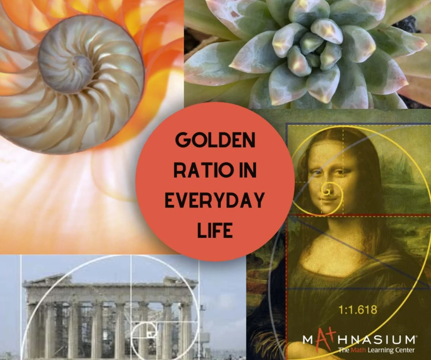
The golden ratio is approximately 1.618:1. Grids and curves based on this proportion offer arrangements that photographers can explore alongside thirds, symmetry and other compositional choices.
These overlays can suggest possibilities, but they cannot prove that an arrangement is more natural, harmonious or successful.
What the overlays can help you explore
The phi grid
A phi grid divides the frame using proportions related to the golden ratio. Its main divisions sit closer to the centre than the familiar rule-of-thirds lines.
Spiral-based guides
A curved overlay can help you compare how shapes and spaces relate across the frame. It does not guarantee that every viewer will follow the curve in a fixed direction.
Points and proportions
Intersections, divisions and curves can provide starting positions for a horizon, focal area or repeated form. Move away from them when another relationship better serves the photograph.
Test an overlay without letting it decide
- Begin with what attracted you and what you want the photograph to communicate.
- Make one version using a grid or curve as a reference.
- Make another version from a different position or arrangement.
- Switch the overlay off and compare the photographs by their meaning, space, visual weight and relationships.

The golden ratio is approximately 1.618:1. It offers an optional reference for comparing proportions within a photograph.
Optional guide · Comparison · Restraint
Use a spiral as a comparison tool
A spiral overlay can help you notice an existing curved relationship between shapes, spaces or repeated elements. It offers one arrangement to compare; it does not determine whether the photograph is successful.
Begin with what attracted you in the scene. Use the guide only when it helps clarify that relationship, then switch it off and judge the photograph itself.
Notice the relationship
Look for a curve, repeated shape or connection already present in the scene. Do not introduce a spiral merely because an overlay is available.
Identify its effect
Decide whether the relationship contributes calm, movement, depth, tension or another response you want the photograph to retain.
Compare alternatives
Make one version using the spiral as a reference and another without it. Compare the space, visual weight and relationships after hiding the overlay.
Does following the spiral clarify what interested me, or does it force the scene into a pattern and remove useful space, tension or context?
Curves are only one possible visual pathway. Explore other connections in Lesson 29 — Leading Lines and Visual Pathways .
Optional grid · Visual weight · Comparison
Compare placements with a phi grid
A phi grid offers possible positions for a horizon, focal area or relationship between foreground and distance. Use those positions as alternatives to explore rather than targets the photograph must satisfy.
Change one decision at a time, then hide the grid and judge how the resulting space and visual weight support what interested you.
Compare the space
Place the horizon at different heights and notice how the relationship between sky, land and foreground changes. More space does not automatically make that area more important.
Compare visual weight
Move an important tree, building, figure or area of light towards and away from an intersection. Notice how its surrounding space affects its prominence.
Remove the guide
Compare the grid-based version with central, thirds-based or freely observed arrangements. Choose according to the photograph’s meaning and effect.
Does this placement strengthen the relationship I noticed, or am I moving important elements simply to satisfy the grid?
For a fuller comparison of compositional guides, revisit Lesson 26 — Composition Rules .

Rule of Thirds, Phi Grid, Symmetry, Fibonacci Spiral, Golden Triangle, Vanishing Point
Review · Meaning · Relationships
Judge the photograph with the guide switched off
Once you have used a grid or curve to explore an arrangement, hide it. Assess the photograph itself rather than how accurately its elements match the overlay.
What now holds attention?
Notice the subject, space, highlights, colour, detail and relationships that attract you. Ask whether they support what you wanted the photograph to communicate.
What did the guide change?
Check whether following the guide strengthened the arrangement or removed useful context, space, tension or an unexpected relationship. Keep only what helps.
Next: visual weight across the frame
The following section considers why elements attract different amounts of attention, regardless of whether they follow a grid. Size matters, but tone, colour, detail, position, space and subject meaning can alter the balance.
Visual weight · Attention · Relationships
Understand visual weight across the frame
Visual weight describes how strongly an element or area attracts attention. Physical size contributes, but it works together with tone, colour, detail, position, space and the meaning of the subject.
Weight is always relative to the surrounding photograph. A small dark figure against pale sand may attract more attention than the much larger light area around it.
What can increase visual weight?
Size and scale
A large or nearby form may attract attention, but a smaller element can still become dominant when its context makes it significant.
Tone and contrast
A small highlight within a dark scene, or a dark figure against a bright field, can carry substantial visual weight.
Colour
Brightness, saturation and the relationship between neighbouring colours affect how strongly an area stands out.
Detail and sharpness
Texture, fine detail and a sharply rendered area may attract attention when the surrounding elements are softer or simpler.
Isolation and position
An element surrounded by quiet space, or placed near an edge, may feel more prominent because it is separated from everything else.
Subject meaning
Faces, gestures, text and recognisable objects may carry weight because of what they mean, even when they occupy little space.
Decide what the relationship should do
Allow deliberate dominance
One area may overpower the others because that emphasis expresses the photograph’s subject or mood. Balance does not require every element to compete equally.
Use space as a counterweight
A small object can relate successfully to a large expanse of sky, water or wall. The space may create scale, isolation, anticipation or calm without needing another object added to fill it.
Compare foreground and background
A nearby form may appear physically large while a smaller distant subject carries more meaning. Focus, blur and atmospheric separation can alter that relationship.
Keep useful tension
Uneven weight, diagonals or a strongly weighted edge can create movement and uncertainty. Retain that tension when it supports what you want the photograph to communicate.

Balancing Visual Mass
Viewpoint · Omission · Support
Change the relationship before adding a counterweight
When part of the frame attracts too much or too little attention, the answer is not always to add another object on the opposite side.
First explore viewpoint, spacing, omission, light and the elements already present. Add something only when it contributes useful scale, context or meaning.
Change viewpoint and spacing
Move sideways, higher, lower, closer or farther away. This can change overlaps, gaps, apparent size and the relationship between foreground and background.
Remove or retain space
Compare excluding an element with allowing a quiet area to remain. A large sky, wall or expanse of water does not need another object added merely to fill it.
Change tone, colour or detail
A change of light, background or timing may alter visual weight without adding anything. In editing, make local changes only when they address a specific relationship.
Include a supporting element
A smaller object can provide scale, context or a relationship with the main form. Keep it for that contribution, rather than treating it as a weight placed mechanically on the other side of a scale.
Compare before deciding
- Make one version using the arrangement that first attracted you.
- Change your position or spacing without adding another element.
- Make a third version that includes or emphasises a supporting detail.
- Compare the stability, tension, scale, context and space in all three versions.
- Choose the photograph that best supports what you intended to communicate.
Restraint question: Does another element genuinely contribute to the photograph, or are you adding it only because the frame does not look evenly balanced?
Review · Compare · Explain
Review the relationship you created
Look at the finished photograph without grids, diagrams or rules visible. Decide whether its distribution of attention supports the feeling, relationship or meaning you recognised in the scene.
What attracts attention?
Identify what you notice first, what you discover afterwards and whether anything competes unnecessarily with the important relationship.
What does the balance express?
Decide whether the frame feels settled, spacious, tense, dominant or deliberately uneven. Describe how that effect supports the photograph.
What would a change cost?
Moving, cropping, darkening or removing something may improve one relationship while weakening context, atmosphere, space or tension.
Compare before making the change permanent
Keep the starting photograph and create one considered alternative. Change only what addresses a specific concern, then compare both versions at the same viewing size.
Choose the version that best preserves what matters. A successful review may confirm that the original photograph needs no further change.
Lesson 32 · Practical application
Practise stability, dominance and tension
Use the approaches in this lesson as different ways to explore one scene. The exercise is to recognise what each choice changes, rather than make every photograph conform to the same kind of balance.
Four approaches you can revisit
Symmetry and repetition
Explore mirrored forms, repeated intervals and central arrangements. Compare a clean pattern with a purposeful interruption.
Asymmetry and visual weight
Compare unequal sizes, tones, colours, positions and areas of detail. Allow dominance or tension when it contributes to the photograph.
Grids and curved overlays
Use thirds, a phi grid or a spiral as optional references. Hide the guide before deciding whether the resulting photograph works.
Space and omission
Consider what a quiet area contributes before adding another object. Space may counterweight, isolate, connect or become part of the subject.
Exercise: compare two intentions
- Choose a scene where one area, relationship or pattern attracts your attention. State what interests you.
- Make one version that feels relatively settled. You might use symmetry, a central relationship or a more even distribution of visual weight.
- Make another version that allows more dominance, asymmetry or tension. Change your position or framing while keeping other choices as similar as practical.
- Check the frame edges, the surrounding space and where attention falls. Briefly squint to notice broad tonal weight, then look normally again to restore detail and meaning.
- Compare the two photographs without an overlay. Explain which version better supports your intention and identify one visible reason.
What demonstrates the learning: neither stability nor imbalance is the required result. The evidence is your ability to explain what changed and why one relationship better serves the photograph.
Lesson 32 · Conclusion
Keep the balance that serves the photograph
Compositional balance concerns relationships across the whole frame. Symmetry, asymmetry, visual weight, space and proportional guides offer different ways to explore those relationships.
The strongest choice may create harmony and stability, or it may retain tension, dominance and uncertainty. Judge the result by what you want the photograph to express.
Notice
Identify what attracts attention and how size, tone, colour, detail, position, space and subject meaning affect the whole frame.
Explore
Compare viewpoint, spacing, omission, symmetry, asymmetry and optional overlays. Use techniques to test possibilities rather than prove that one arrangement is correct.
Explain
Choose the version that best supports your intention. Describe the visible relationship that makes it stronger and what you would explore next.
Practice helps these decisions become more intuitive, but intuition still benefits from comparison and review. A familiar guideline can help, and a deliberate departure can work when you understand what the change contributes.
Restraint in the Photography Composition Framework includes recognising when an arrangement already communicates what matters and should be left alone.
SEE → FEEL → TECHNIQUE: notice the relationships, recognise your response, then choose the compositional method that supports it.
Find Your Compositional Balance
Download the 1-page field checklist or book live support.
Lesson 32 · Common questions
Compositional Balance FAQs
What is compositional balance in photography?
Compositional balance concerns how visual weight is distributed across a photograph. Size, tone, colour, detail, position, space and subject meaning influence where attention falls. The resulting stability or tension should support what the photograph expresses.
Does a photograph always need to look balanced?
No. Deliberate dominance or imbalance may express tension, movement or uncertainty. Compare arrangements and choose according to their effect. Equal visual weight is not required in every successful photograph.
Can a centred subject make a good composition?
Yes. Central placement can support symmetry, directness or stillness. Compare it with an off-centre arrangement and consider the surrounding space. Choose the placement that better supports your intention.
What is the difference between symmetry and balance?
Symmetry concerns mirrored or repeated forms. Balance concerns the distribution of visual weight. An asymmetrical photograph can feel balanced, while an apparently symmetrical scene may contain one element that attracts much more attention.
Is the golden ratio better than the rule of thirds?
No overlay guarantees a better photograph. The golden ratio and rule of thirds suggest arrangements you can compare. Switch the guide off and judge the resulting relationships, space and meaning within the image.
Do I need to fill empty space to balance a photograph?
No. Space can contribute scale, stillness, isolation or tension without another object. Compare omission, viewpoint and spacing before adding a counterweight. Keep an additional element only when it contributes to the photograph.
What gives an element visual weight?
Size, brightness, colour, contrast, detail, sharpness, isolation and recognisable meaning can all attract attention. Their effects depend on the surrounding image. A small dark figure against a pale background may carry considerable weight.
How can I practise compositional balance?
Make two versions of one scene: one relatively settled and one allowing more dominance or tension. Compare the response each supports and identify a visible reason for your preference. Use that observation to guide your next photograph.
Composition series · Continue
Continue learning
Next Academy lesson
Lesson 33 — Photography as an Art of Observation
Move from Restraint to Observation: notice what is actually happening before deciding which camera or compositional choice to make.
Related composition lessons
Personal feedback: Image Reviews Clinic — 30 minutes, £29