
How to Improve Your Photography Composition: A Guide
Updated 27 Sep 2026
Lesson 34 · Judgement
Review what the photograph communicates
Improving photography composition begins by comparing what you intended with what the finished image actually communicates.
Look at where attention goes, what supports the subject and what competes with it. Then choose one specific decision to change or practise.
Composition improves through a cycle of making, reviewing and trying again. Rules and techniques can suggest possible solutions, but your judgement determines whether they strengthen this particular photograph.
Three things to take from this lesson
Recall your intention
Identify what made you take the photograph and what you wanted the viewer to notice or feel.
Diagnose one decision
Review the frame, timing, visual weight, light and distractions. Describe the specific choice that helped or weakened the image.
Choose what to try next
Turn the review into one practical adjustment for editing, another version of the photograph or your next session.
Academy Composition Framework · Lesson 34
Where this lesson fits
Compare the finished photograph with what you intended to communicate. Identify what worked, what weakened the image and which decision you want to refine next.
SEE → FEEL → TECHNIQUE → REVIEW
Judgement
Does the photograph do what I intended?
Your focus in Lesson 34: review the photograph’s visual hierarchy, balance, frame edges, timing and atmosphere. Turn what you discover into one clear adjustment or practice goal.
Video 4 · Judgement
The Judgement group connects these two lessons:
- 34 — Improve Composition · you are here — review individual photographs and learn from specific decisions.
- 35 — Finding Your Style — recognise the subjects, moods and choices you repeatedly return to.
Judgement is part of the photographic process, not a final verdict. Use it to understand your choices, test alternatives and decide what to explore next.
Explore the full Photography Composition Framework →
Table of Contents Show
How to improve your photography composition
Technical accuracy does not automatically produce an effective photograph. Exposure, focus and camera control help you record the scene, while composition determines how its elements relate and where the viewer’s attention goes.
Improvement comes from reviewing specific decisions. Recall what interested you, examine whether the finished photograph communicates it and decide what you would keep or change. Drawing on more than fifteen years of teaching, the principles below give you practical areas to examine rather than a formula for every image.
Use the Photography Composition Framework to connect your review with intention, restraint and observation.
Make the photograph
Respond to what interests you and make deliberate choices about viewpoint, timing and framing.
Review the result
Compare the image with your intention and identify which visual decisions helped or weakened it.
Choose the next experiment
Turn the review into one practical adjustment for editing, reshooting or your next photographic session.
Beyond technical execution
From recording reality to communicating experience
“Reality is a decent reference, but a terrible master.
The camera records what’s there — the artist reveals what it felt like to be there.”
— Alan Ranger
Technical control helps you describe a scene accurately. Artistic judgement begins when you decide what deserves emphasis, what can be left out and how framing, timing, light and technique can communicate your response.
The photograph develops through four connected decisions
Reality
Notice what is present and what attracts your attention.
Record
Use the camera to describe light, detail and relationships.
Reveal
Make choices that communicate what mattered and how it felt.
Review
Judge whether the finished photograph expresses that intention.
Ask during your review: does this photograph merely describe what was in front of me, or does it reveal why I responded to it?
How to judge one photograph
Compare what you intended with what the finished image actually communicates. Work through these questions in order, then make one deliberate change and review again.
Purpose comes first. Composition principles and camera settings are tools for expressing that purpose; they are never the purpose of the photograph.
Intention
What interested me, and what did I want the photograph to communicate?
Attention
Where does the viewer’s eye go first, and where does it travel next?
Evidence
Which choices in framing, timing, light and technique support that intention?
Diagnosis
What strengthens the photograph, and what weakens or competes with it?
Next decision
Keep, change or test one thing. Judge the new result against the same intention.
A principle or camera setting matters only when it helps the photograph express what you intended.
Use the relevant prompt, not every prompt
Fifteen principles are not fifteen boxes to tick
The principles offer different ways to diagnose a photograph. You do not need to force every image through all fifteen. Begin with what you intended, identify the area that best explains the result and use the relevant prompt to decide what to retain or change.
15 diagnostic prompts
4 connected areas
Purpose comes first. Composition principles and camera settings serve the photograph’s intention. Select the prompt that helps you understand this photograph and decide what to try next.
Choose the relevant area of judgement
The fifteen principles are diagnostic prompts. Begin with the photograph’s purpose, choose the area that best explains what is helping or weakening it, and review one decision at a time.
01 · Purpose & feeling
What should the photograph communicate?
02 · Attention & structure
How is the eye organised inside the frame?
03 · Relationships & visual language
What meaning comes from the elements together?
04 · Review & refinement
What can the finished photograph teach me?
Purpose comes first. Composition principles and camera settings serve the photograph’s intention. They are never the purpose of the photograph.
Purpose & feeling
Begin with what mattered and how the photograph should feel. Technical decisions are judged by whether they communicate that response.

Shoot What It Feels Like, Not Just What It Looks Like
A photograph can be sharp, correctly exposed and carefully arranged while still feeling emotionally flat. Technical quality supports the image, but it cannot decide what the photograph is about or why another person should care.
Begin the review by recalling what drew your attention. It may have been a gesture, atmosphere, relationship, quality of light or sense of scale. Compare that experience with what the photograph now communicates.
Why did I take it?
Describe the subject, moment or feeling that made you raise the camera.
Where does attention go?
Identify what the viewer is likely to notice first and what they discover afterwards.
Do those answers agree?
If attention goes somewhere else, identify which visual element is competing with your intention.
Make the review specific
Avoid conclusions such as “it does not work” or “the composition is wrong.” Name the decision instead: the background is brighter than the subject, the gesture happened too early, or the frame includes space that weakens the relationship.
Return to Lesson 33: Observation and Lesson 28: Storytelling when you need to clarify what originally mattered in the scene.
Capture Emotion, Not Just Visuals
Emotional effect develops through visible choices: gesture, timing, expression, light, colour, space and the relationship between subjects. Technical perfection cannot replace those clues.
Recall what the scene felt like and ask whether that atmosphere appears in the finished photograph. If it does not, identify which compositional choice changed or weakened the response.
The observation methods in Lesson 33: Photography Is an Art of Observation help you recognise those moments before they pass.
Review question: what visible evidence allows another person to recognise or feel the atmosphere you experienced?

Embrace Imperfection
Blur, grain, unusual placement, uneven balance or incomplete information can contribute to a photograph when they support its mood or meaning. Judge them according to their effect rather than against a fixed idea of technical perfection.
There is a difference between deliberate imperfection and an accidental decision that weakens the image. Compare it with a more conventional version when possible and examine what each communicates.
Review question: does the imperfection contribute something valuable, or am I using creative intention to excuse an avoidable mistake?
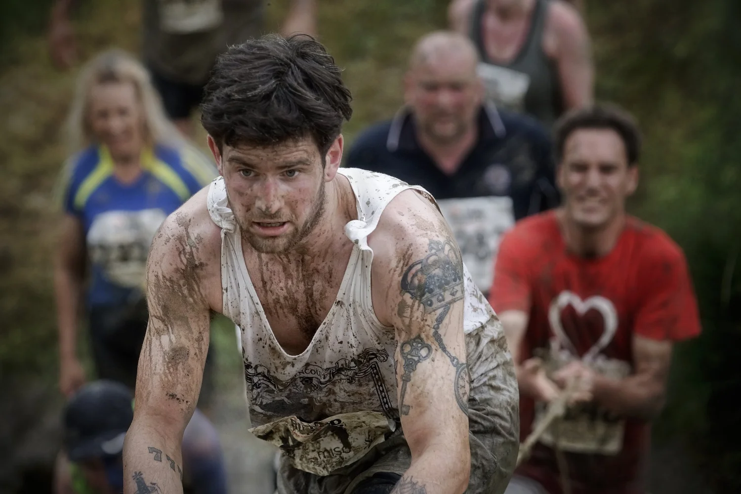
Judge the moment, not only the action
The same event can communicate competition, struggle or consequence. Timing decides which account the photograph gives, while gesture, posture and context provide the evidence.
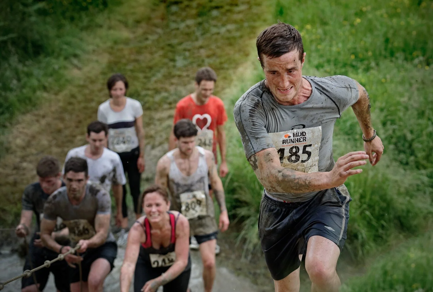
Competition
Position and separation establish the immediate stakes.

Determination
Expression and gesture reveal the inner effort behind the action.

Consequence
The frame shows effort after peak action has passed.
Attention & structure
Review how the frame organises attention. These are ways to test the photograph, not rules that must become its subject.
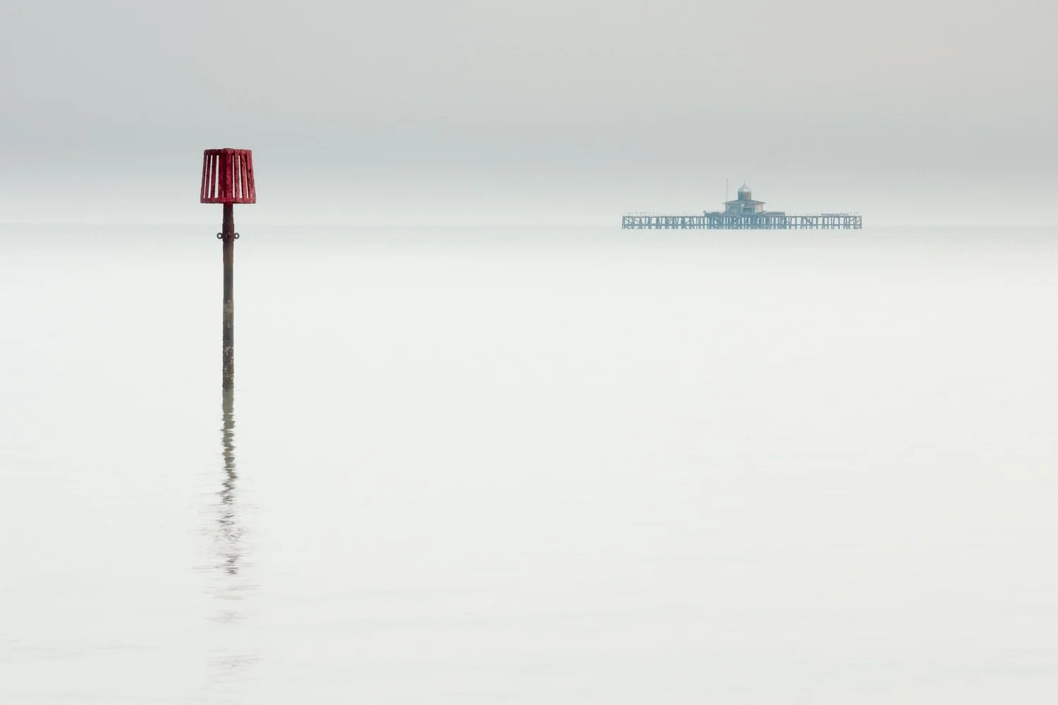
Master the Rule of Thirds
The rule of thirds divides the frame into nine sections using two horizontal and two vertical lines. Placing a subject or important feature near one of the intersections can create direction, reveal context or give a moving subject space to travel into.
Compare the result with a centred or more asymmetric arrangement. The grid is useful when it strengthens the relationship between elements; it should not determine the composition automatically.
Review the wider range of photography composition rules before deciding which placement best supports this photograph.
Review question: does this placement help the viewer notice what matters, or does it simply follow the grid?
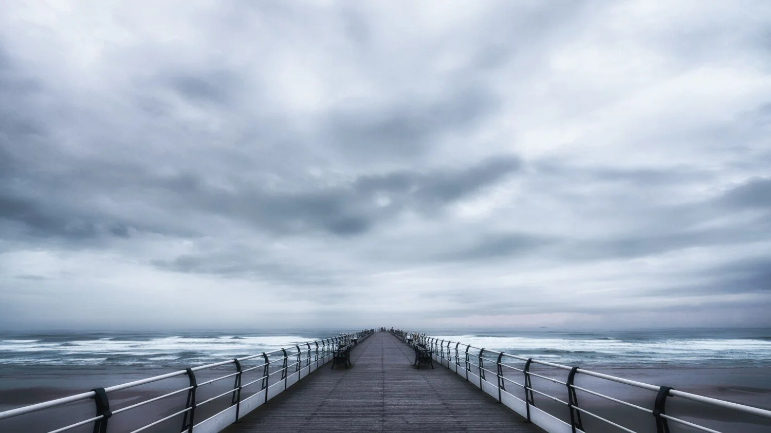
Use Leading Lines to Guide the Eye
Leading lines are visible or implied pathways that guide attention through a photograph. They may be natural features such as rivers and coastlines, or constructed elements such as roads, fences and architectural edges.
Trace each line from where it enters the frame. Notice where it leads, whether it connects important elements and whether it carries the viewer towards the subject or away from it.
Lines can also create depth, movement or visual rhythm. Their value depends on what they contribute to the photograph rather than how strongly they appear. Explore the technique further in Lesson 29: Leading Lines in Photography .
Review question: where does each pathway take the viewer, and is that destination important to the photograph?

Simplify Your Frame for Greater Impact
Simplification helps the viewer understand what matters. Review every element according to whether it supports the subject, atmosphere or relationship you intended to communicate.
A detailed photograph can still be clear. The aim is to organise complexity and control competing information rather than make every composition empty.
Ways to simplify the composition
- Move closer or use a tighter frame.
- Change position to separate overlapping elements.
- Wait for a distraction to leave the background.
- Use depth of field to control background detail.
Explore how restraint works in minimalist photography , while remembering that simplicity can support any photographic style.
Review question: which element could be removed, reduced or repositioned without weakening what the photograph communicates?

Balance Visual Weight
Visual weight describes how strongly different elements attract attention. Size, brightness, contrast, colour, detail, faces and position can all make one part of the frame feel more dominant.
Symmetrical balance
Mirrored or evenly distributed elements can create stability, order and formality. Symmetry works particularly well when the subject itself contains repetition or reflection.
Asymmetrical balance
A large quiet form may be balanced by a smaller bright, colourful or detailed element elsewhere in the frame. The photograph does not need equal amounts on both sides.
The goal is a distribution that suits the subject and mood. Explore this further in Lesson 32: Compositional Balance .
Review question: does one area dominate unintentionally, or does the distribution of visual weight support the photograph?

Utilise Negative Space
Negative space is the area surrounding the main subject. It can create scale, calm, isolation, movement or anticipation while helping the subject remain visually distinct.
Review the shape and proportion of the space rather than treating it as unused background. Too little may make the subject feel cramped; too much may weaken it unless emptiness is part of the photograph’s meaning.
Explore how subject and surrounding space work together in Lesson 30: Negative Space in Photography .
Review question: what does the surrounding space contribute to the subject’s scale, direction or emotional effect?

Watch Your Borders
The edges of the frame determine where the visible world ends. Bright fragments, cropped shapes and awkward mergers near those edges can attract attention away from the subject.
Scan all four borders and corners before releasing the shutter. A small movement left, right, higher or lower may remove a distraction or separate overlapping elements without changing the main idea.
Cropping during editing can help, but checking at the scene gives you more deliberate control. Revisit Lesson 27: Framing in Photography for a fuller method.
Review question: does anything enter, leave or touch the frame in a way that distracts from the photograph?
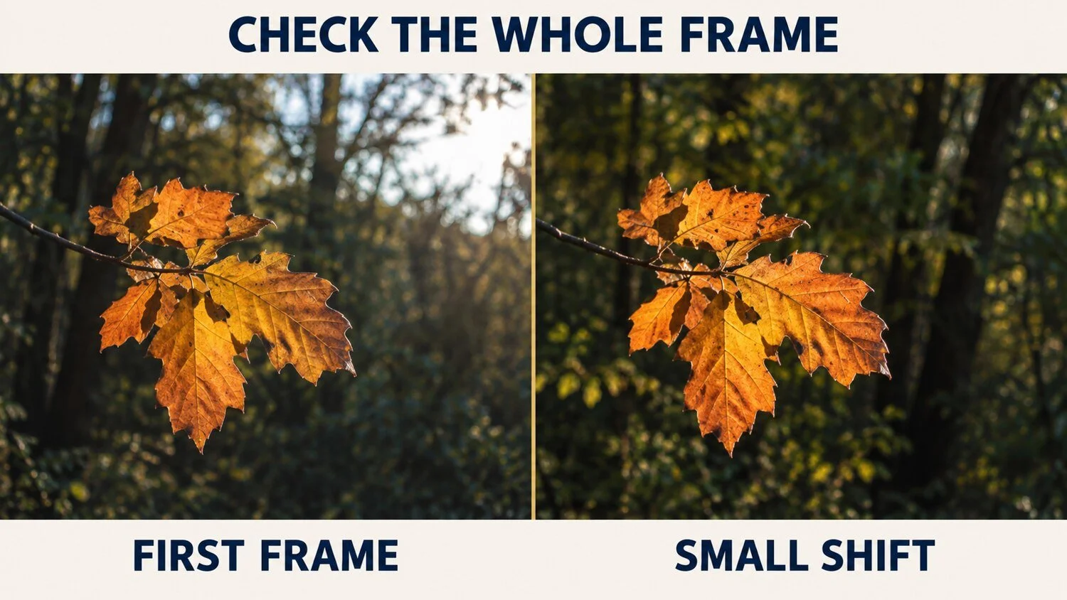
First frame → small shift. Moving slightly removes the bright sky and lets the leaf hold attention. The camera settings did not solve the problem; judgement at the frame edge did.

Understand Depth and Dimension
A photograph turns a three-dimensional scene into a flat surface. Position, scale, overlap, perspective and focus help the viewer understand the space within that surface.
Foreground, middle-ground and background elements can create layers, but each layer should contribute. Moving the camera often changes their relationship more effectively than changing the lens.
Depth of field also affects separation and context. A shallow depth of field can isolate the subject, while greater depth may reveal relationships across the scene. Learn more in What Is Depth of Field? .
Review question: do the layers lead the viewer into the photograph, or do they overlap in a confusing way?
Judge, move and refine
These photographs were made at the same beach. The judgement is not which one follows a rule most closely, but which organisation of space, form and atmosphere best expresses the photographer’s response.
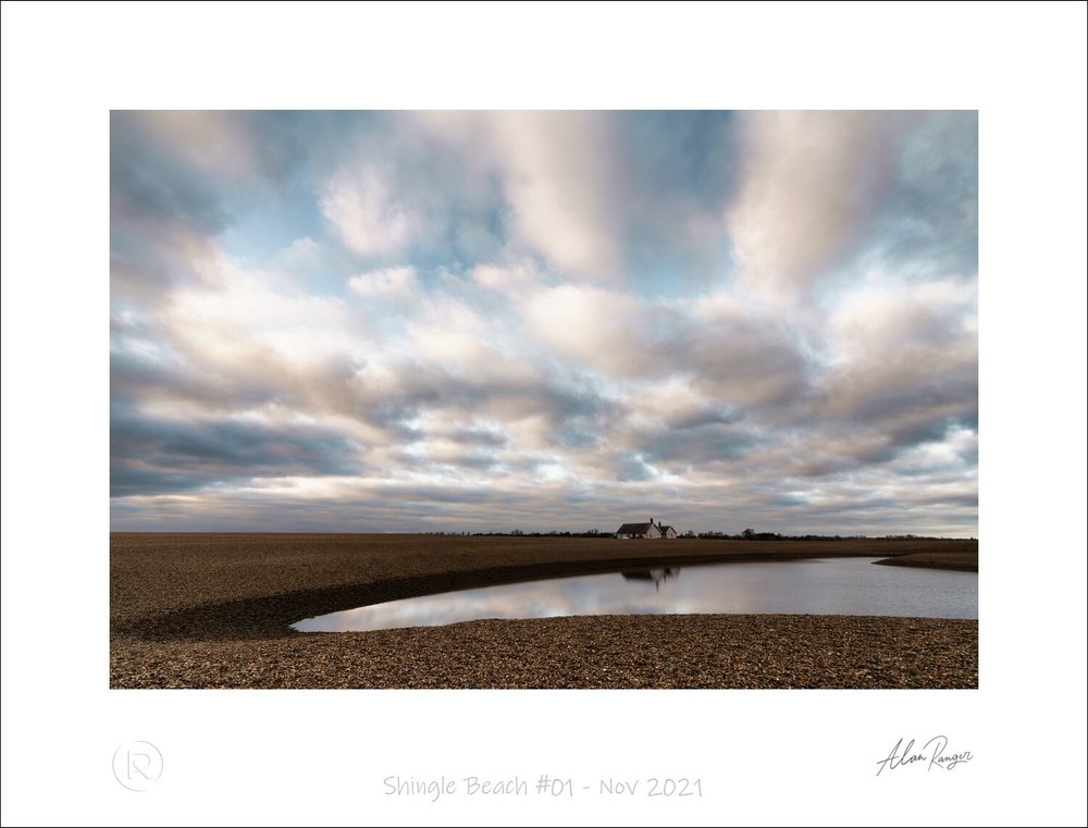
1 · Establish
Include enough space to understand the place.
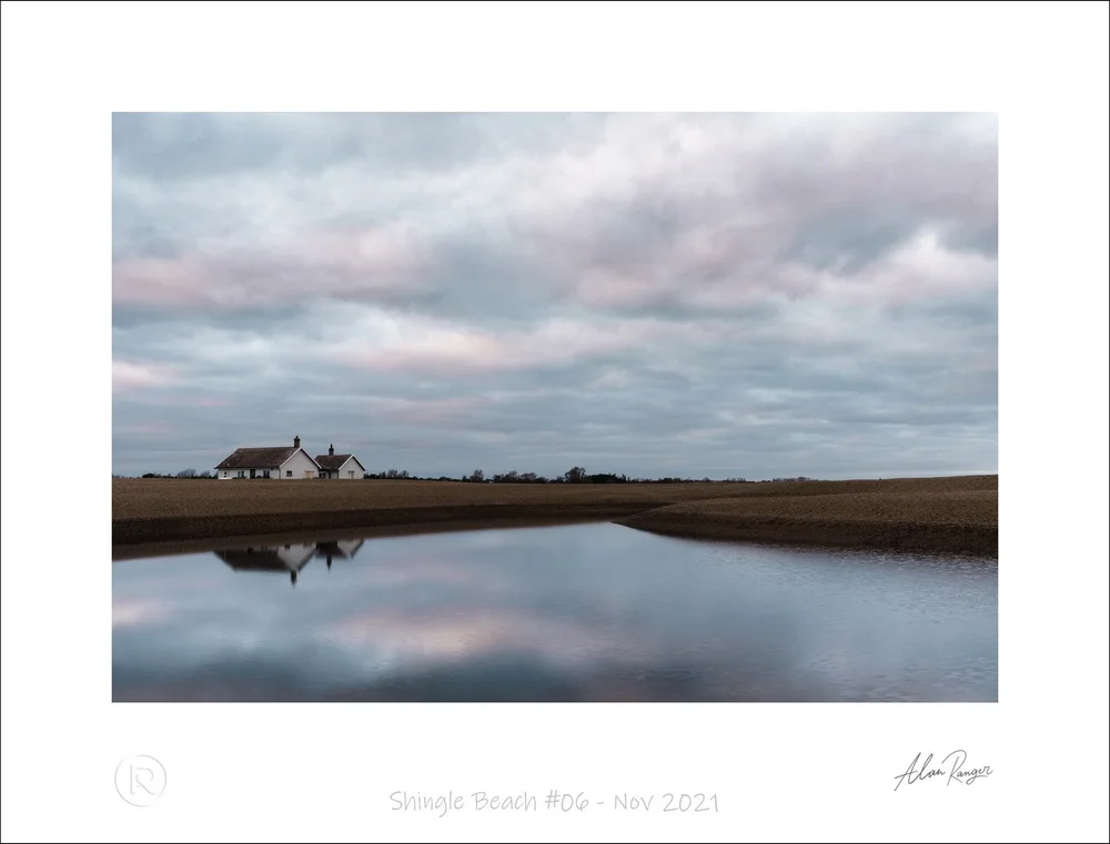
2 · Reorganise
Change position and scale to strengthen relationships.
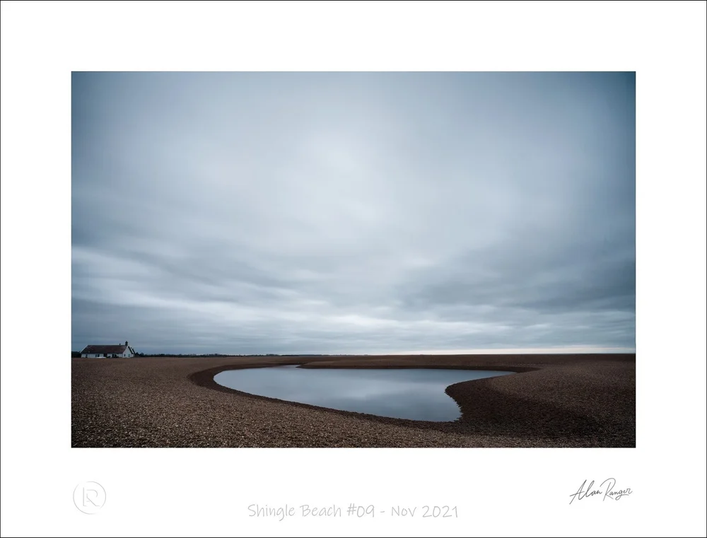
3 · Refine
Decide whether closer detail communicates the response more clearly.
Relationships & visual language
Judge how colour, contrast, repetition, juxtaposition and movement create meaning between elements.

Use Colour Theory to Enhance Composition
Colour affects visual weight, atmosphere and attention. Saturated or warm colours often appear more dominant, while muted or cool colours may recede, although their effect always depends on the surrounding image.
Contrast and emphasis
Complementary or strongly different colours can separate the subject and create visual energy. A small area of strong colour may outweigh a much larger neutral area.
Harmony and atmosphere
Analogous or monochromatic colours can create cohesion, quietness and a consistent mood.
Review colour alongside brightness and tonal difference. The lesson on contrast in photography explains how these differences influence attention.
Review question: which colour attracts attention first, and does that emphasis support the subject?

Master Juxtaposition
Juxtaposition places contrasting elements within the same frame so their differences create meaning. The contrast may involve old and new, natural and constructed, large and small, stillness and movement, or light and dark.
Create a visible relationship
The two elements must feel connected through placement, timing or context. Simply including unrelated differences does not automatically create a narrative.
Use tension with purpose
Visual tension can invite comparison and encourage the viewer to interpret the scene. Review whether that contrast adds meaning or merely makes the frame busier.
Tonal and colour differences can reinforce the relationship. Explore these choices in Lesson 31: Contrast in Photography .
Review question: what relationship does the contrast suggest, and can the viewer recognise it without a long explanation?

Harness the Power of Patterns and Repetition
Repeated shapes, colours, tones or objects can create visual rhythm and guide attention through the photograph. Patterns occur in natural forms, architecture, human activity and changing light.
Establish the rhythm
Look at the spacing and direction of repeated elements. Regular repetition can produce stability, while changing intervals can introduce movement and variation.
Interrupt the pattern deliberately
A different colour, shape or position within a repeated arrangement can become the focal point. The underlying pattern must be clear enough for the difference to be noticed.
Review question: does repetition guide attention and strengthen the subject, or has the pattern become the only idea?

Incorporate Movement and Flow
Movement can appear through a subject’s direction, diagonal forms, repeated gestures, implied pathways or motion blur. These elements affect how quickly and in which direction the viewer reads the frame.
Shutter speed determines whether movement is frozen, suggested or visibly blurred. Choose it according to what the movement should communicate rather than treating blur or sharpness as automatically correct.
Experiment with flowing water, moving people or changing light using the methods in How to Take Long Exposure Photos .
Review question: does the direction and treatment of movement support the energy or atmosphere you intended?
Review & refinement
Compare the finished photograph with the original intention, diagnose one issue and turn what you discover into the next practical experiment.
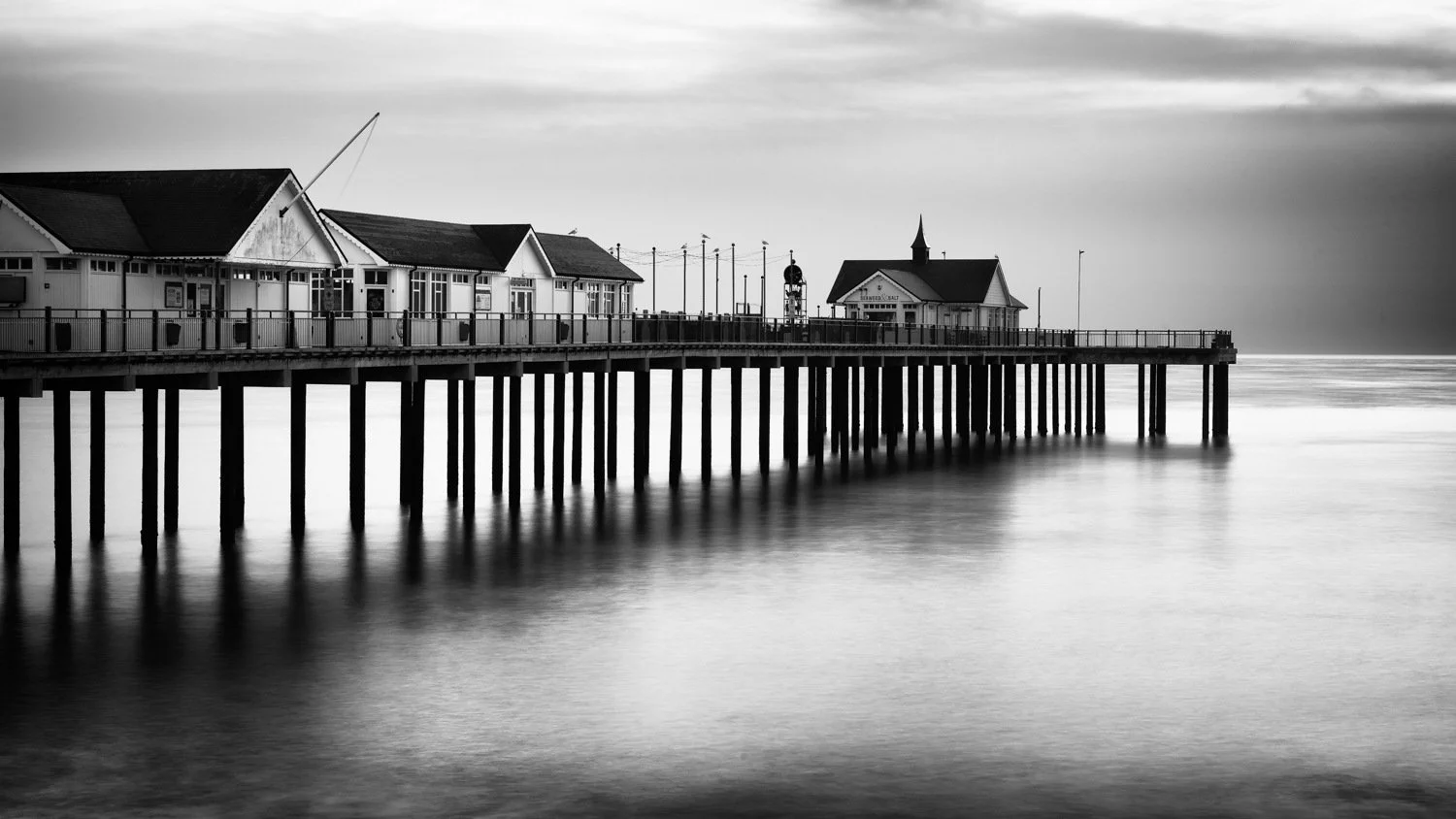
Edit Your Photos Thoughtfully
Editing helps refine the photograph and understand the decisions made at the scene. Cropping, tonal adjustments, colour and local contrast can clarify attention and reinforce atmosphere.
Begin with the original intention. Adjust what helps communicate it and avoid making every area equally bright, detailed or saturated. Restraint preserves visual hierarchy.
Use editing as feedback
Notice which corrections appear repeatedly. If you often crop distractions from the same edge or darken bright backgrounds, turn that pattern into something to watch for during the next session.
Review question: has the edit clarified what mattered in the original scene, and what can it teach me before I next use the camera?
A ten-minute review of one photograph
Choose one recent image. Write short, specific answers and finish with one practical experiment for the next attempt.
RECALL
What made me stop, and what did I want the viewer to notice or feel?
TRACE ATTENTION
Where does my eye enter, pause and leave? Does that route support the subject?
NAME THE EVIDENCE
Which choices about viewpoint, timing, light, framing or technique help?
DIAGNOSE ONE ISSUE
What single element most weakens the intention: competition, confusion, imbalance or timing?
CHOOSE ONE EXPERIMENT
What will I change in the edit, the reshoot or the next comparable situation?
The aim is to understand this photograph well enough to make the next one more deliberate.
Conclusion: How to improve your photography composition
Improving photography composition comes from understanding your decisions rather than applying every rule to every image. Begin with what you intended to communicate, observe where attention travels and identify the specific choice that helped or weakened the result.
The fifteen principles in this guide provide different ways to examine framing, visual weight, space, colour, movement and emotional effect. Select the principle that best explains the photograph in front of you, then turn that review into one practical adjustment.
Use the Photography Composition Framework to reconnect this review with intention, restraint and observation. Continue with Lesson 35: Finding Your Photography Style to recognise the choices and subjects you repeatedly return to.
FAQs on improving your photography composition
These answers address common questions about recognising, reviewing and improving composition.
How can I improve my photography composition?
Begin by deciding what you want the photograph to communicate. Review where attention goes, remove or reduce competing elements and change one decision at a time, such as viewpoint, timing, framing, visual weight or use of space.
What are the most important photography composition rules?
Common starting points include the rule of thirds, leading lines, framing, balance, negative space, patterns and visual contrast. Treat them as options to explore rather than instructions that every photograph must follow. See Lesson 26: Photography Composition Rules for the wider approach.
How can I tell whether a photograph has a good composition?
Ask whether the viewer notices what matters, whether the elements support the intended mood or story and whether anything competes unnecessarily for attention. A successful composition communicates clearly, even when it deliberately uses imbalance, ambiguity or visual complexity.
How do I simplify a busy photography composition?
Move closer, change your camera position, separate overlapping elements or wait for background distractions to disappear. You can also use light, focus or negative space to make the main subject easier to recognise.
How do I create balance in a photograph?
Compare the visual influence of size, brightness, colour, contrast, detail and position. Balance does not require symmetry: a small bright element can balance a larger quiet area when their visual weight feels appropriate to the photograph. Explore this further in Lesson 32: Compositional Balance.
Should I always follow photography composition rules?
No. Use a rule when it strengthens the subject, relationship or atmosphere you want to communicate. Centred placement, deliberate imbalance, motion blur and unusual cropping can all work when their effect supports the photograph.
Can editing improve photography composition?
Editing can refine composition through cropping and adjustments to tone, colour and local contrast. Begin with the original intention and use restrained changes to clarify attention rather than making every part of the image equally bright, detailed or saturated.
What is the best way to practise photography composition?
Choose one compositional idea for each session, make several versions and compare what changes. Record which choices helped or weakened the image, then turn that review into one practical goal for your next session using the Photography Composition Framework.