
Contrast in Photography: Choose What Deserves Attention
Updated 12 Oct 2026
Decide how much contrast the photograph needs
Contrast in photography describes differences between tones, colours, textures or ideas. Those differences can separate elements, reveal a relationship or influence where attention falls.
Notice the contrast already present before trying to increase it. A subtle distinction in mist or a quiet colour relationship may be precisely what attracted you. Stronger contrast is useful when it supports that response.
Restraint can mean leaving an adjustment unused, reducing a competing highlight or preserving a gentle transition. Compare the result with what you wanted the photograph to express.
Three things to take from this lesson
Recognise the difference
Look for tonal, colour, textural and conceptual relationships within the scene.
Choose the emphasis
Consider which differences deserve attention and which compete with what matters.
Compare before adjusting
Keep an edit only when it helps. The starting image may already have enough contrast.
Where this lesson fits
Notice what draws your attention, recognise what you want to communicate, then choose the tools that support it.
SEE → FEEL → TECHNIQUE
- Intention
- Restraint · this lesson
- Observation
- Judgement
Restraint
What can I leave out?
Consider which differences deserve emphasis. Preserve subtle contrast or reduce competing areas when that better supports the photograph.
Video 2 · Restraint
- Lesson 30 — Negative Space
- Lesson 31 · Contrast — you are here
- Lesson 32 — Compositional Balance
The four themes work together throughout photography. Return to any of them whenever it helps you reconsider a choice. The video groups connect related lessons; the Academy’s numbered route stays the same.

⏱️ CHAPTERS
00:00 - Introduction: Composition with Restraint
01:21 - Lesson 30: What Is Negative Space?
02:24 - Active Space: Sky, Water and Horizon Decisions
03:17 - How Much Space Do You Need? (In-Field Comparison)
04:49 - Three Rules for Using Negative Space
05:16 - Lesson 31: Contrast - Tone, Color and Texture
06:34 - Low Key vs Contrast
07:05 - Testing Contrast: How Much Is Enough?
08:19 - Three Rules for Contrast and Separation
08:52 - Lesson 32: Compositional Balance and Visual Weight
09:25 - Symmetry vs Asymmetrical Balance
10:40 - The Golden Ratio and Phi Grid Overlay
11:45 - 5 Factors That Control Visual Weight
13:20 - Three Rules for Compositional Balance
13:47 - Space, Contrast and Balance: The Practical In-Camera Challenge
Table of Contents Show
What contrast means in a photograph
Contrast is a difference you perceive between elements. Its effect depends on the surrounding image and the meaning of the things being compared. High and low describe the strength of a difference; they are not separate subjects you must include.
Tonal contrast
Differences in brightness can separate forms, describe surfaces or draw attention. Strong contrast does not require clipped white highlights or black shadows.
Colour contrast
Differences in hue, saturation and lightness affect how colours relate. A small muted colour can matter as much as a vivid complementary pair.
Textural contrast
Smooth water beside rough stone can make their surfaces more apparent. Light, focus and viewing size influence how clearly that distinction appears.
Conceptual contrast
Old and new buildings, or activity beside stillness, can suggest a contrast in ideas. Context helps the viewer recognise the relationship.
Identify what it already contributes. A gentle transition may express the scene more effectively than an emphatic separation.
High Contrast - bright highlights dark shadows
Low contrast - mainly mid-tones
Textural and colour contrast: the detailed bee and spiky thistle stand out against the smooth, subdued background. The warm orange and cool purple provide further separation without overpowering the subject.
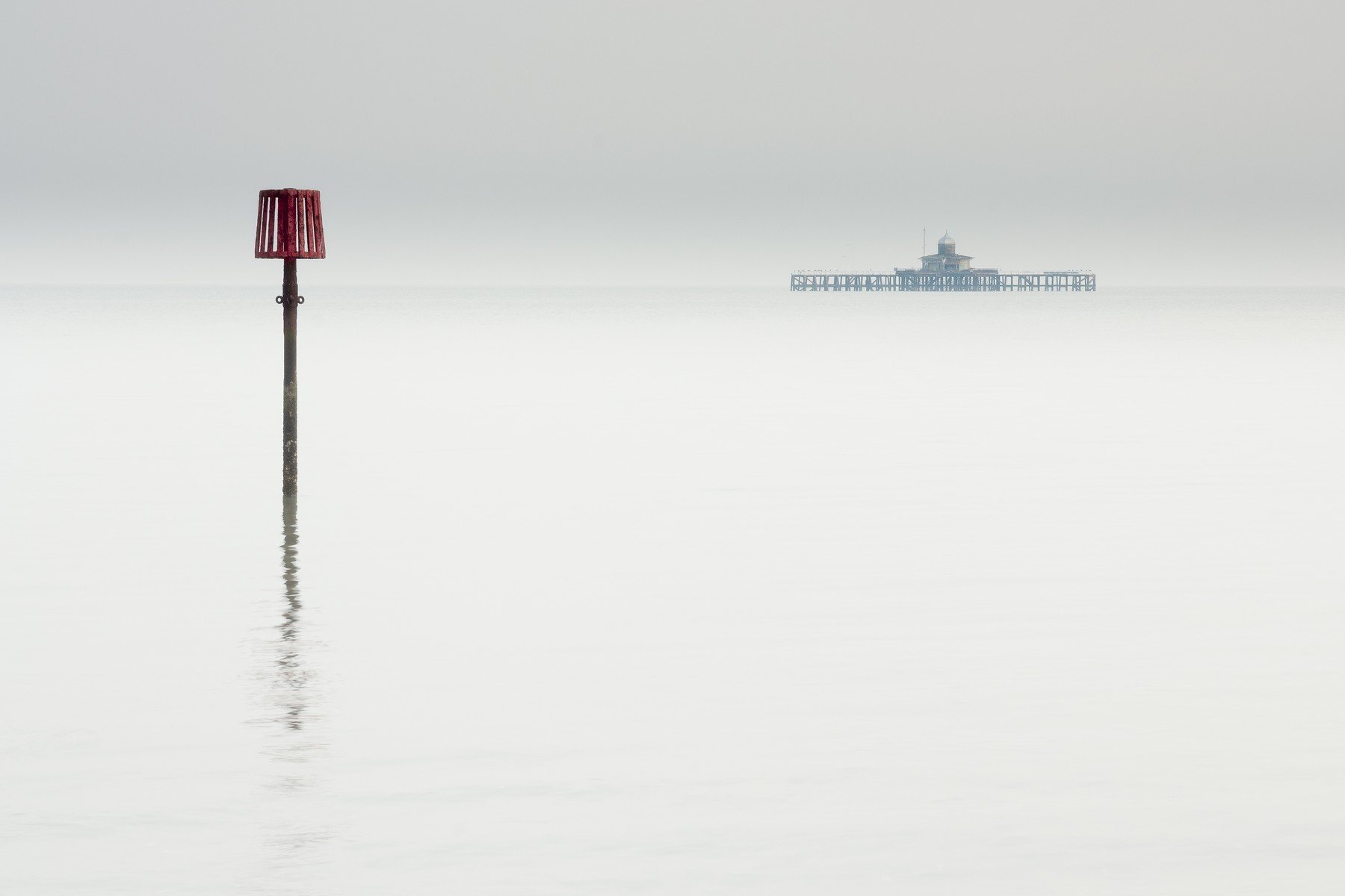
Conceptual contrast: the near navigation marker and the distant remains of the old pier create a relationship across the quiet water. Their different scale, distance and form separate the two structures while linking them within the same sparse frame.
Observe the light before changing the image
Watch the relationships
Watch where light falls, what remains in shadow and how those areas change. Direction, diffusion and reflected light affect the relationships you can photograph. Moving your viewpoint may change the background behind an element as much as the light on it.
Choose what you need to retain
Protect highlight detail when that detail matters. A bright reflection or deep silhouette may serve a different purpose. Check the result and choose exposure for the information and feeling you want to retain.
Stay responsive as the light changes
When the scene is changing, stay ready to respond. Lesson 33 — Observation develops attention to light, moments and relationships.
Tonal contrast in black and white
Removing colour changes the relationships within an image. Compare whether brightness, shape and texture now express what interested you. Black and white can work through gentle transitions as well as pronounced dark and light areas.

High Contrast B&W
How neighbouring tones relate
Look beyond the overall tonal range
Tonal contrast concerns differences in brightness. The same patch can appear lighter or darker depending on its surroundings. Look at adjacent areas as well as the overall range of the image.
Choose the separation that serves the photograph
Strong separation may help a shape stand out, while a subtle transition can preserve atmosphere. There is no requirement to place the greatest contrast on one named subject: several areas may form the relationship you want to show.

Contrast, shape and depth
Notice what the light reveals
Light and shadow can reveal changes in surface and suggest depth. They can also flatten forms into a graphic pattern. Notice which effect interests you before adjusting the tones.
Compare before choosing
Compare a stronger and gentler treatment. Check whether detail, atmosphere or important transitions disappear. Keep the version that supports the photograph, including the starting version when it already works.

Tonal Contrast Perception

Tonal Contrast Perception
Want to master contrast in your shots?
Control light, colour & texture. Learn how contrast shapes mood and storytelling.
Colour relationships and white balance
Complementary colours
On a traditional colour wheel, pairs such as blue and orange or red and green sit opposite one another. They offer relationships to explore. Their impact also depends on brightness, saturation, area and surrounding colours.
Warm and cool colours
Warm and cool are useful descriptions of colour relationships. They do not guarantee a mood. A warm scene can feel threatening and a cool scene can feel peaceful; subject and context matter.
White balance: the direction of the adjustment
For the same raw photograph in Lightroom Classic, raising the Temp value makes the rendering warmer; lowering it makes the rendering cooler. This is a compensation control and should not be confused with describing the colour temperature of the light source.
Compare changes on the same file, keeping the other controls fixed. Judge whether the colour supports what you wanted to preserve. A particular Kelvin value does not produce a reliable mood across different scenes.
Reference: Adobe’s image tone and colour guidance.
Using a colour wheel
Use the wheel to explore relationships, then assess the actual photograph. An overlay or diagram cannot determine whether the colours express your intention.

Colour contrast · context
Judge colours in context
Consider visual weight
Notice how much of the frame each colour occupies and how it relates to nearby tones. A small bright area may attract more attention than a large subdued one.
Preserve quiet colour
For a planned shoot, colour samples can help you explore alternatives. In the field, begin with the available scene and your response to it.
Restraint question: Before increasing saturation elsewhere, could you reduce the emphasis of the colour that is demanding too much attention?
Blue and Orange complementary colours
Tonal distribution · contrast
High key, low key and contrast
High key photography
A high key photograph is dominated by lighter tones. It can still contain a strongly contrasting dark shape or distinct differences between neighbouring areas.
Low key photography
A low key photograph is dominated by darker tones. It may use pronounced highlights, but it can also preserve gentle transitions within its shadow areas.
Keep the terms separate: key describes the image’s overall tonal distribution. Contrast describes the differences between areas. Neither one determines a fixed emotion or treatment.

High Key

Low Key
Capture choices · tonal contrast
Silhouettes, backlighting and HDR
Silhouettes and backlighting
Backlighting places the light behind the subject relative to the camera. Depending on exposure and fill light, the result may show detail, a lit edge or a silhouette.
Choose a silhouette when shape and separation communicate enough without internal detail. Compare the outline, background and relationship between forms before deciding.
Use HDR when the scene needs it
Merging bracketed exposures can retain detail across a scene whose brightness range exceeds what one exposure records adequately. Movement between exposures may cause merging problems.
The final rendering can be subtle or pronounced. Use the additional information only when it supports the photograph.
Restraint question: Does the image need detail throughout the tonal range, or are its highlights and shadows already doing useful work?
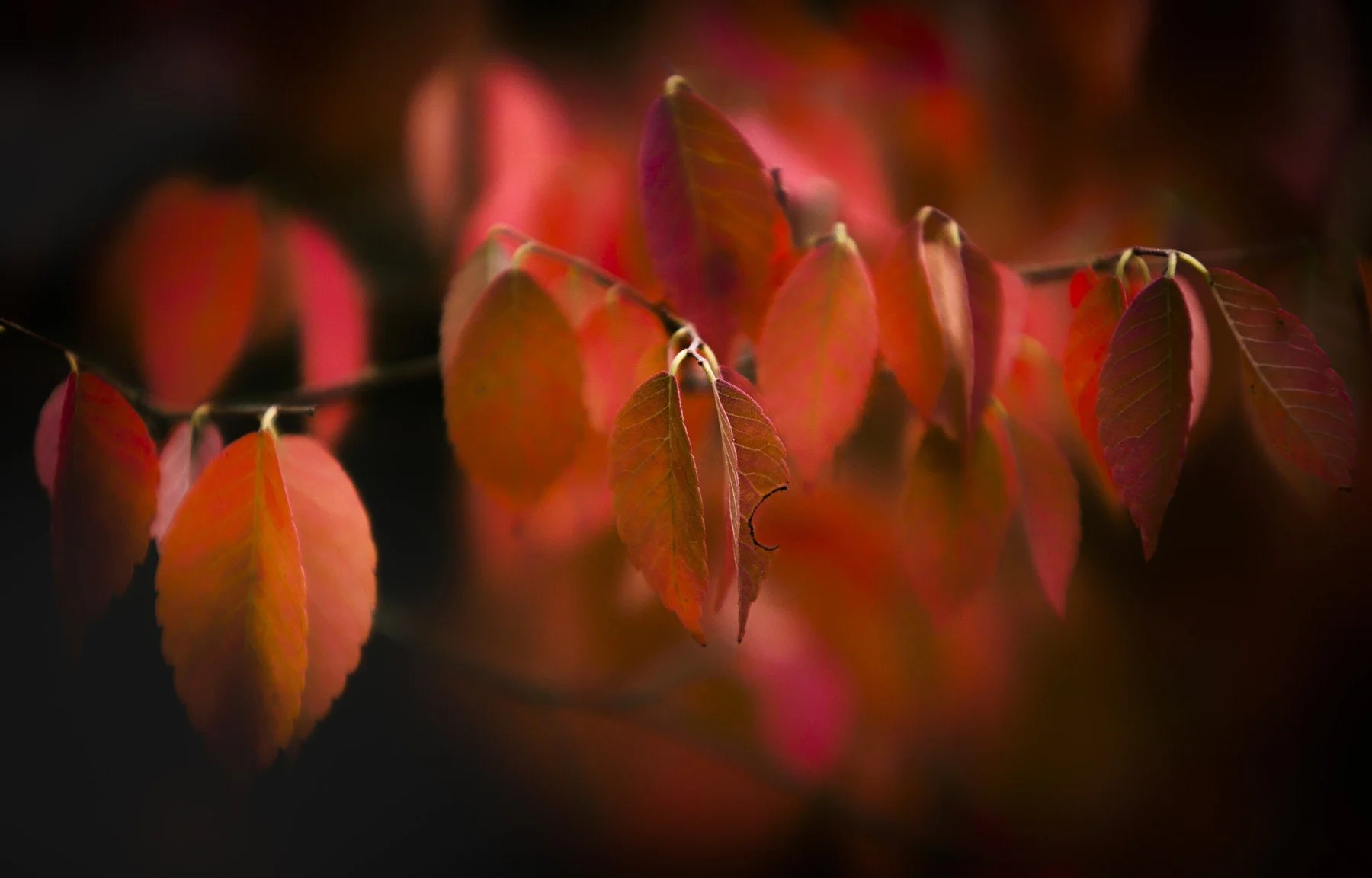
Backlighting reveals the translucent colour and shape of the leaves against the dark background. The contrast provides clear separation while the restrained shadows preserve the quiet atmosphere.
One photograph, three contrast decisions
These three versions differ only in contrast. Compare the separation between the hills, trees, water and reflections. Notice what each treatment preserves, emphasises or removes before deciding which one best expresses the atmosphere.
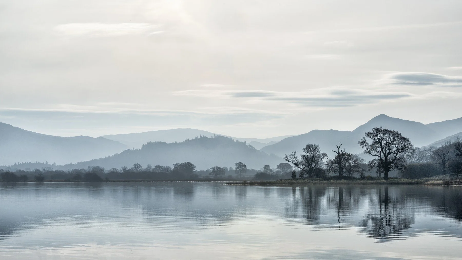
Starting version: the original balance of tonal separation and atmosphere.
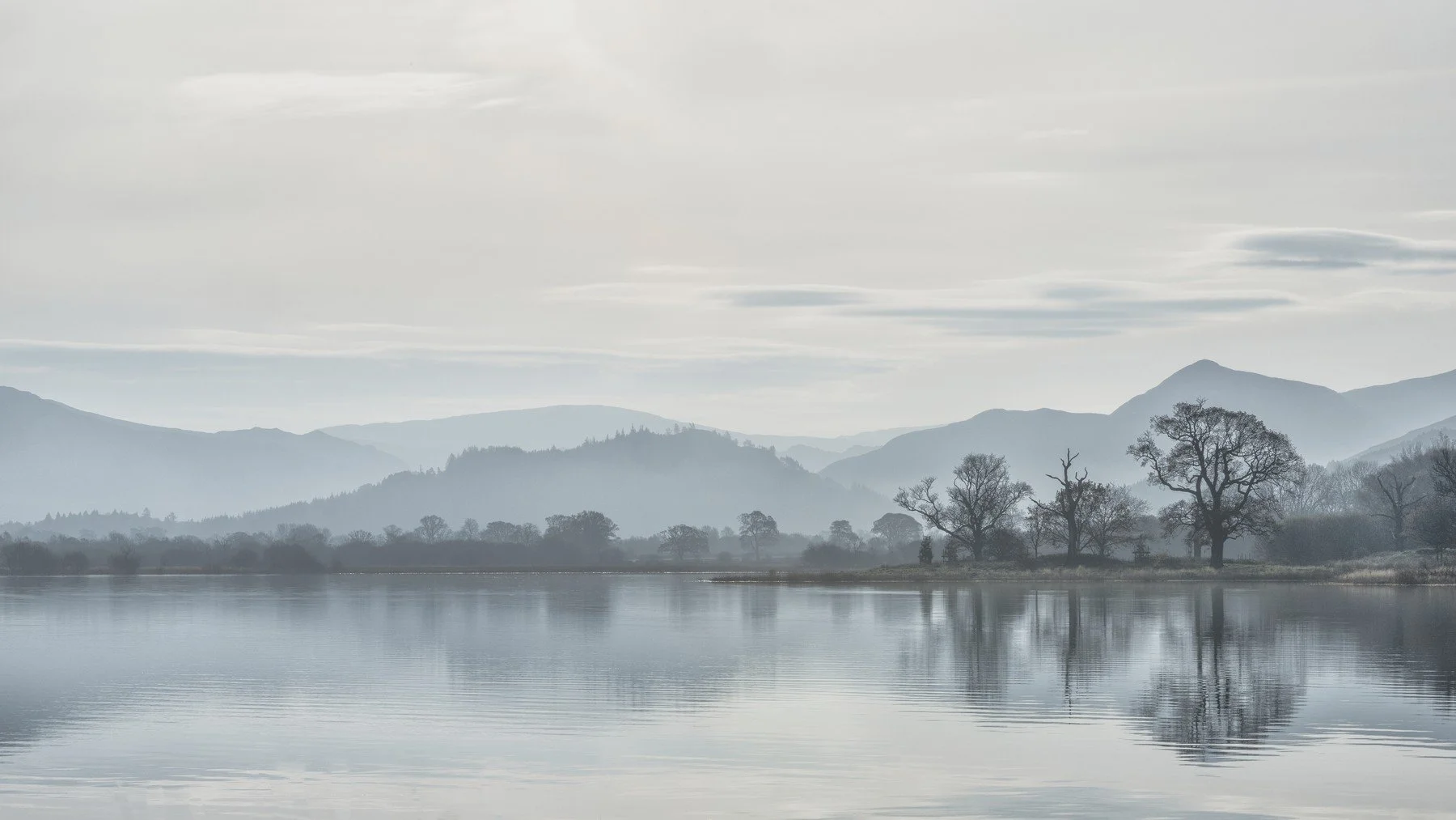
Gentler contrast: softer separation preserves the mist and quiet transitions.
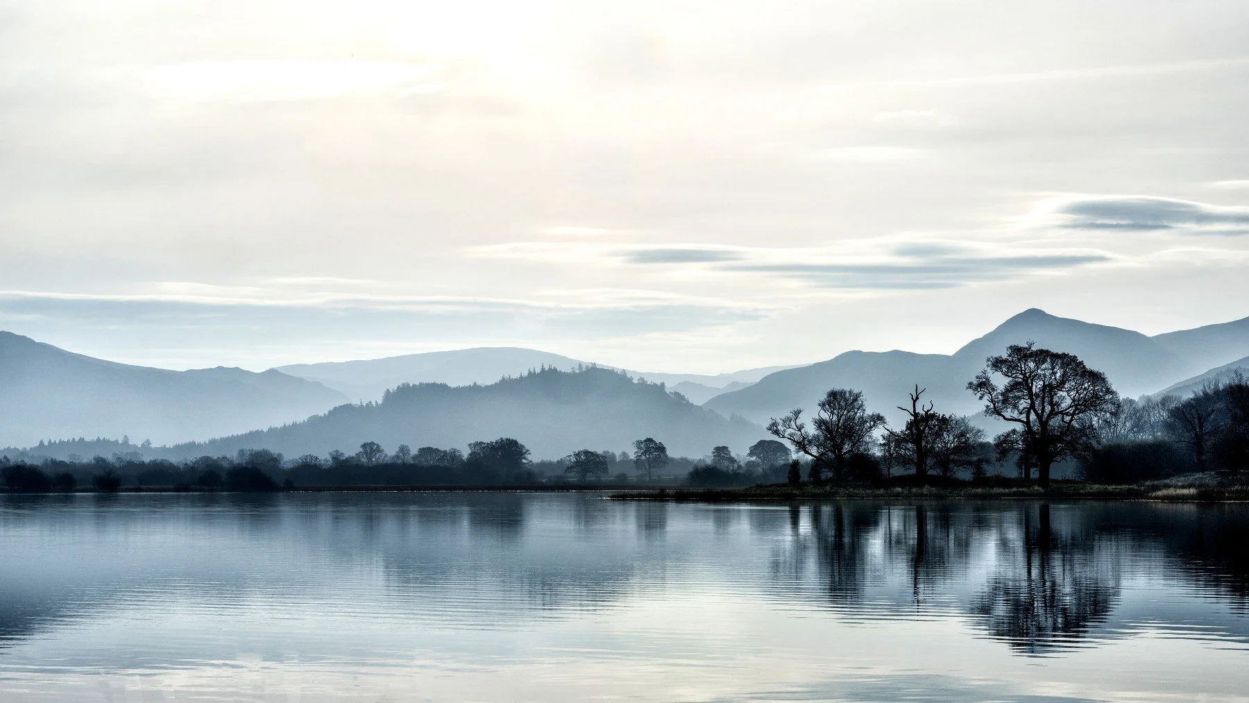
Stronger contrast: darker trees and clearer separation add definition but reduce some subtlety.
Editing practice · Compare first
Compare before increasing contrast
Begin by completing this sentence: “What I want to preserve in this photograph is _______.” Use that answer to judge every adjustment.
This follows the review approach in You Don’t Know What a Good Photograph Looks Like and Lesson 34 — Improving Composition .
- Create three versions. Keep the starting image, then make one stronger and one gentler contrast interpretation.
- Change one thing at a time. This makes it easier to identify what an adjustment contributes and what it removes.
- Compare at the intended viewing size. Look for lost detail, halos, altered colour and changes in atmosphere.
- Choose for a visible reason. Select the version that supports your intention. Leaving the starting image unchanged is a valid outcome.
Choose an editing tool for a specific purpose
Curves
Adjust tonal relationships or separation. Check that highlights, shadows and gentle transitions you value remain intact.
Texture and Clarity
Change local midtone detail. Apply them selectively when surface character matters and watch for halos or an unnatural appearance.
Colour grading
Explore relationships between highlights, midtones and shadows. Keep the change only when the colour supports the intended atmosphere.
Dodge and burn
Lighten or darken specific areas to adjust attention and visual weight. Avoid turning every local difference into stronger contrast.
Final check: After every local adjustment, look at the whole photograph again. Confirm that the change supports what you wanted to preserve rather than simply making the image more dramatic.
Lesson 31 · conclusion
Let contrast serve what matters
Notice the differences already present, decide which ones matter and compare the effect of any change. Strong contrast can be useful; preserving a subtle relationship can be equally deliberate.
Within the Photography Composition Framework, Restraint asks what can be left out. That includes unnecessary emphasis and unnecessary editing.
SEE → FEEL → TECHNIQUE: observe the contrast, recognise your response and then choose whether a technical change will support it.
Lesson 31 · common questions
Contrast in photography FAQs
What is contrast in photography?
Contrast describes differences between tones, colours, textures or ideas in a photograph. These differences can separate elements, suggest relationships and influence where the viewer’s attention goes.
What is the difference between high and low contrast?
High contrast involves stronger differences, while low contrast involves gentler differences. The best choice depends on the photograph’s meaning, detail and atmosphere.
Does high contrast require pure black and white?
No. Strong differences can exist without pure black shadows or pure white highlights. Clipping is a separate issue, so decide which highlight and shadow detail matters before allowing it to disappear.
Are high key and low contrast the same thing?
No. High key describes an image dominated by lighter tones. Low contrast describes relatively gentle differences. A high key photograph can still contain a strongly contrasting dark element.
Does a higher white-balance Temp setting make a photograph warmer?
For the same raw photograph in Lightroom Classic, raising the Temp value makes the rendering warmer and lowering it makes the rendering cooler. This compensation control differs from describing the colour temperature of the original light source.
Should I always increase contrast when editing?
No. The existing contrast may already express what matters. Compare the starting image with stronger and gentler treatments, then keep a change only when it supports your intention.
What is conceptual contrast?
Conceptual contrast is a relationship between different ideas or subjects, such as old and new or activity and stillness. It depends on context and meaning rather than brightness or colour alone.
How does contrast relate to restraint?
Restraint means deciding which differences deserve emphasis and which ones compete with the photograph’s purpose. It may involve reducing a bright distraction, preserving subtle colour or leaving an unnecessary edit unused.
Continue the composition series
Continue learning
Related photography lessons
Personal support: Explore 1-to-1 Online Zoom Lessons