
Photography Editing Workflow Guide - Why & What to Edit
Table of Contents Show
The slider problem
Most photographers I teach do not have an editing problem. They have a decision problem.
They sit down in front of a RAW file, open Lightroom Classic, and start pushing sliders. Exposure up a touch. Highlights down. Shadows up. Clarity… maybe a bit more. Saturation creeping. Twenty minutes later they have an image that looks different, but they cannot tell you whether it looks better. And when they come back the next day with fresh eyes, they often start again.
This is not a tool failure. The tools are extraordinary. It is a process failure — and more specifically, an intent failure. When you do not know what the image is meant to communicate, every slider feels equally important and you keep moving them in the hope that one of them will tell you when to stop.
The good news is that this is fixable, and it is fixable without learning a single new tool. What follows is the editing workflow I teach in my 3-week Lightroom course in Coventry and refine with private clients in 1-to-1 sessions. It is built on three intent questions, a 7-stage process, and one stubborn principle: decide before you slide.
The framework uses Lightroom Classic as the reference tool because that is what most of my students use, but it is software-agnostic. The same seven stages and the same three questions apply equally in Photoshop, Capture One, Affinity Photo, or anything else that handles RAW.
Why edit at all?
It is worth pausing on the question, because the answer shapes everything that follows.
A RAW file is not a finished photograph. It is a record of the data your sensor captured — full tonal range, full colour information, no in-camera processing decisions baked in. Compared with a JPEG, which has been interpreted by the camera according to its picture profile, a RAW file looks flat, slightly cool, and a bit lifeless when it first appears on screen. That is the point. The camera has not made any creative decisions for you. You are going to make them.
Editing, then, is not rescue work. It is intent realisation. It is the stage where you take what the sensor recorded and shape it into what you actually saw — or what you actually felt — when you pressed the shutter. A photograph that goes straight from camera to screen with no editing has not been finished; it has just been left at the camera's default interpretation.
One more thing worth saying clearly: in Lightroom Classic, your edits are non-destructive. The original RAW file is never altered. Lightroom records your adjustments as a list of instructions in a sidecar file (the .xmp), and you only see the result of those instructions when you view the image inside Lightroom or export a copy. Capture One and Bridge work in similar ways. This means you can experiment freely. Nothing you do in the develop module is permanent until you export.
That permission to experiment matters. It is hard to be brave with sliders if you think you are damaging the file. Once you understand that you are not, the editing process becomes a place to make decisions rather than a place to be careful.
Three questions before any slider
This is the centre of everything else in this article. Before you touch any control in any panel of any editor, ask yourself three questions about the image in front of you.
Question 1: What am I trying to communicate with this image?
What is the photograph for? What is the subject? What story or idea is it trying to put across? "It is a photograph of bluebells" is not enough. "It is a photograph of the moment when bluebell light fills the woodland and you can see why people get emotional about spring" — that is a brief you can edit to.
Question 2: What caught my eye originally — and have I emphasised that?
This is the question most people skip. You pressed the shutter for a reason. Something specific made you stop walking and lift the camera. Was it the light skimming across the grass? The way one tree was lit and the others were not? The reflection in the puddle? Whatever it was, the edit's job is to make sure that thing is still the strongest element when a viewer looks at the finished frame. If you cannot answer this question, you have an edit that will drift.
Question 3: What feeling, emotion or mood do I want the image to communicate?
Calm? Drama? Stillness? Tension? Heat? Cold? Mystery? This question decides your global tonal direction long before you adjust a single slider. A "calm woodland" edit and a "moody woodland" edit start from the same RAW file and end up in completely different places — and the difference is set in your head before you start, not discovered halfway through.
Once you have answers — even rough ones — you have a brief. You also have a finishing test. When you think the edit is done, look at the before-and-after and ask whether the final image actually delivers on those three answers. If it does not, step back through the History panel until you find the point where it went off course, and reprocess from there. Sometimes that means scrapping ten minutes of work. That is a feature, not a bug. Better to scrap ten minutes than to publish a drifted edit.
This intent-first approach is closely connected to the wider thinking I cover in my Landscape Photography Vision Framework. Vision is what you bring to the shoot; intent is how you express that vision in the edit. The two reinforce each other.
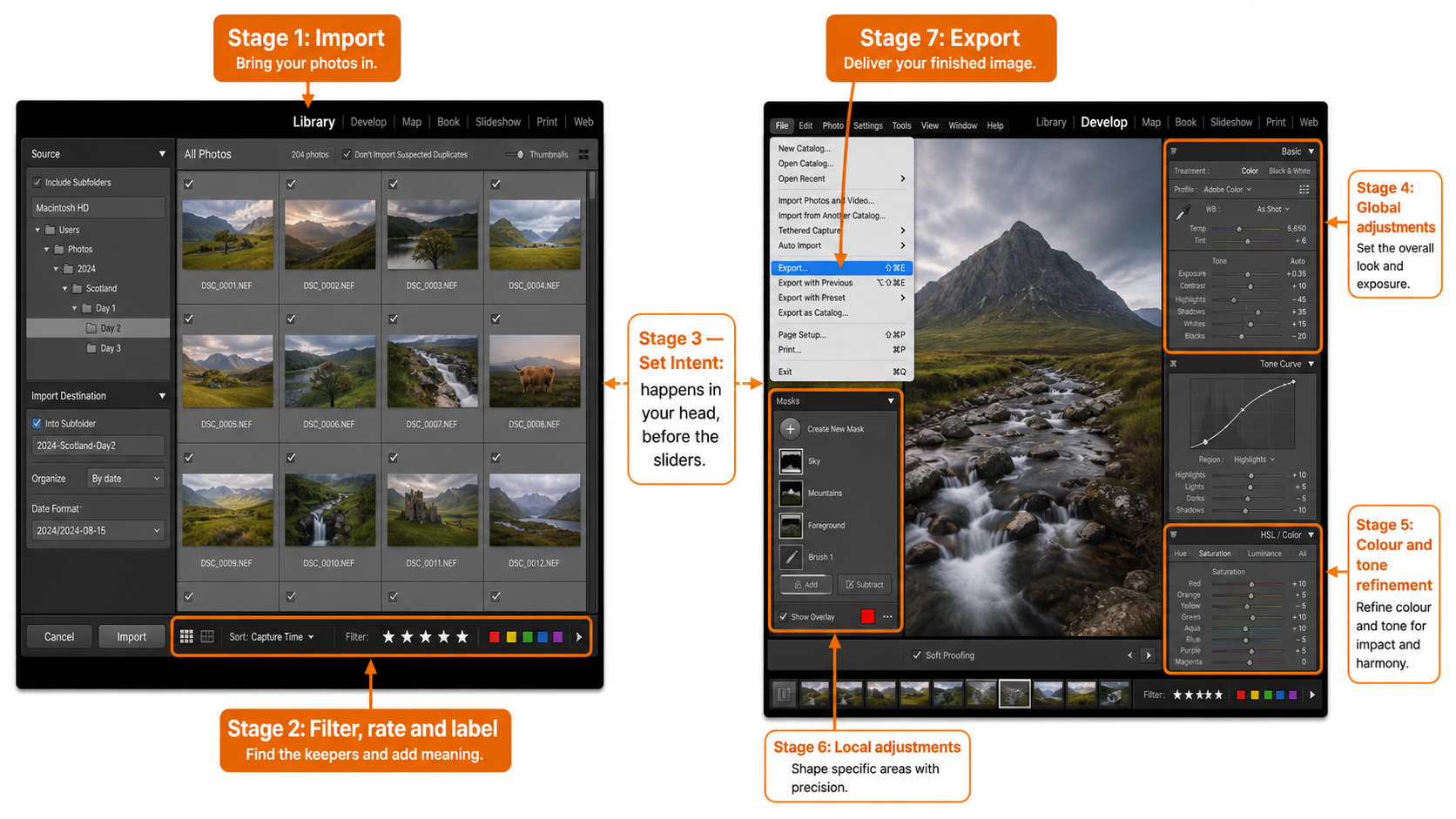
The 7-stage workflow framework
Most editing inconsistency comes from working in a different order every time. If your only structure is "open the file and start adjusting," then the result depends on your mood, your screen brightness, and how tired you are. A repeatable workflow removes that variability so you are evaluating the photograph rather than rebuilding the process from scratch.
The stages below are the order I follow on every image. The diagram shows them as a linear flow because that is how to learn them. In practice you will sometimes loop back — adjust intent after seeing the global pass, or revisit a global decision after a local one — and that is normal. But you start at Stage 1, you finish at Stage 7, and the order matters.
The 7-stage editing workflow
From RAW capture to finished export — a repeatable framework you can run in any serious RAW editor.
If you find this calm, intentional approach to editing useful, the US landscape photographer Mark Denney has built his teaching on the same foundation. In his recent video "You're Overthinking RAW Editing" on the Mark Denney YouTube channel, he makes the same core point I make in my Coventry classes: editing feels hard because there is no clear process, not because you are doing something wrong.
Stage 1 — Import & organise
Editing begins before you ever look at the develop module. How you import images decides whether you can find them again, whether your hard drive becomes a dustbin in two years, and whether your future self will thank you or curse you.
I recommend a simple, software-agnostic folder structure: Year / yyyy-mm-dd. So a shoot on 14th April 2026 lives in 2026 / 2026-04-14. That is it. No "best of," no "edited," no "favourites" at this level. Those are jobs for collections (in Lightroom) or smart albums (in other tools), not folders. Folders are for raw originals. Collections are for the way you currently want to look at them.
On import, do three things every time: render 1:1 previews (saves you waiting later when you are ready to cull), apply your standard copyright metadata as a preset (your name, contact, basic rights statement), and let the software file the images automatically by date. Lightroom will create the dated folder for you if you set the destination once and save it as a preset. After that, importing becomes a two-click action.
None of this is glamorous. It is, however, the difference between a library you can search in five years and a hard drive full of folders called "untitled exports." If you have ever ended up with the same image stored four times across two drives — different filenames, different versions, no idea which is the master — you already know what bad import discipline costs. There is a real-world case study in how to delete duplicate photos in Lightroom Classic covering exactly that situation, where a client had accumulated 10,000 duplicates across multiple storage locations.
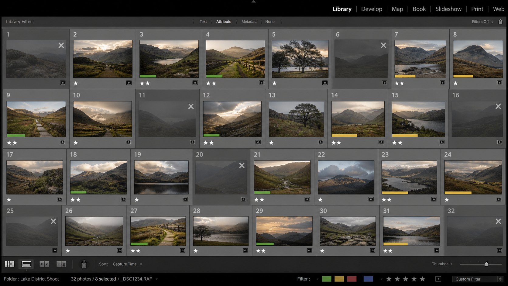
Stage 2 — Select & cull
Culling is where most photographers under-invest. It is treated as admin — get through it quickly so you can start the "real" editing. In fact, the cull is editing. Choosing which images deserve your attention is a creative decision, and it sets the tone for everything that follows.
I use a star-rating ladder rather than a simple keep/reject flag. The star levels are the same in every editor:
The point of the ladder is that it gives you a way to pass over the same set of images multiple times, applying a different filter each pass. First pass: anything obviously soft, badly composed, or technically broken gets X (rejected). Second pass: filter to "ok" and above, then promote anything that catches the eye to 1 star. Third pass: filter to 1 star and above, then choose between near-duplicates and demote the weaker ones back to 0. This is much faster than trying to make a final decision on every image in one sitting.
Alongside ratings, I use colour labels for workflow state. The colour-label convention I teach is below. There is no fixed industry standard for what each colour means, so the convention only has to be consistent for you — but having one is what matters.
Colour-label convention for workflow state
Ratings record image quality. Colour labels record where the image is in your workflow. Use them together for searchable, filterable progress tracking.
| Label | Workflow stage | Use case |
|---|---|---|
| Blue | Published / final | Edit complete and the image has been published or delivered. The "done" state. |
| Yellow | Bracketed for editing | Part of an exposure-bracketed sequence still to be merged or processed. |
| Green | To be edited | On the active to-edit list. The "in progress" queue. |
| Red | To be deleted | Confirmed for removal. Pairs well with the X rating; gives you a final pause before disk deletion. |
| Purple | Portfolio | Selected for portfolio inclusion. Independent of publishing state — a portfolio image may or may not be public. |
There is no fixed industry standard for what each colour means. The convention only has to be consistent for you — but having one is what matters.
Combine ratings (image quality) with colour labels (workflow state) and you have a system where you can answer questions like "show me everything from this trip that is rated 2 stars or above and still needs editing" with one filter click. That kind of organisation is the difference between a library that supports your creativity and one that buries it.
Stage 3 — Set intent (apply the three questions)
You have culled. You have a shortlist of images worth editing. Pick the strongest candidate. Open it in the develop module — and then do not touch a slider.
This is the pause point where most workflows go wrong. It is the moment when habit pulls you toward starting work, and discipline says wait. Re-read the file. Look at it. Ask the three questions from earlier in this article: what am I communicating, what caught my eye, what feeling do I want? Decide your destination before you start the journey.
You can do this in your head, but I find it useful to keep a notebook open and jot down a one-line answer for each. "Quiet bluebell woodland — soft light through the trees — calm and a bit nostalgic." That is now the brief. When the edit is done, you compare the result against the brief. If it matches, you are done. If it does not, you back up.
The reason this works is that it forces you to be specific. "I want it to look nice" is not a brief. "I want the warm side-light to feel like the strongest thing in the frame" is. The first version invites endless tinkering because every adjustment can be argued for. The second version closes the question down: every adjustment either supports the warm side-light or does not.
Stage 4 — Global adjustments
Globals come first because they affect the entire image. There is no point doing precise local work on a frame whose overall tone is still wrong; you will only redo it.
The order I follow inside the global stage matters too. The basic panel sliders are listed top-to-bottom in roughly the order they should be used — Adobe did not put them in that order by accident. I work the panel as a top-down checklist:
Lens correction first. Profile-based lens correction removes vignetting and distortion that the lens itself introduced. This is correction work, not creative work. It happens before anything else because its effects ripple into everything downstream — you do not want to set exposure based on a vignette you are about to remove.
Crop and straighten. Decide the final frame before you start tonal work. If you are going to crop into a tighter composition, the histogram of the cropped area is what matters, not the histogram of the whole sensor capture.
White balance. Set the colour temperature before you set tone. Use the eyedropper on something neutral if there is one in the frame, or set it by eye to match the mood you decided in Stage 3. Remember that "correct" white balance and "right for this image" are not always the same thing — the warm side-light you are emphasising may need a slightly warmer white balance than a colour chart would call accurate.
Exposure, then contrast. Get the overall brightness right first. The exposure slider is essentially a midtone brightness control with some highlight protection built in. Once exposure feels correct, contrast is your next decision — how much separation do you want between the light and dark parts of the frame? Higher contrast makes images feel punchier and more dramatic; lower contrast makes them feel calmer and more open.
Highlights, shadows, whites, blacks. Use highlights and shadows to recover or push detail in the bright and dark areas of the frame. Use whites and blacks to set the actual end-points of your tonal range — how close the brightest pixel gets to pure white, and how close the darkest gets to pure black. These four sliders together give you precise control over the tonal shape of the image. (Pro tip: hold the Alt or Option key while moving whites or blacks to see the clipping mask. Move the slider until pixels just start to appear, then back off slightly.)
Texture, clarity, dehaze. Treat these as seasoning, not main course. Clarity adds midtone contrast and is easy to overdo. Alan's rule of thumb: "be careful not to overdo it or your photo will look like it has had a dose of steroids." Dehaze is more aggressive than clarity and works particularly well on misty or hazy conditions — but be aware it amplifies vignetting and sensor dust, so apply lens correction and spot removal first.
Vibrance and saturation. These are the last basic-panel decisions. Vibrance is non-linear — it boosts the less-saturated colours more than the already-saturated ones, and it has a built-in protection for skin tones. Saturation is linear — it pushes everything equally. For most images, vibrance is the safer choice. "Don't use a slider unless you need to" applies particularly here: many images need no saturation adjustment at all.
If exposure context would help, my guide to what exposure is in photography covers the in-camera side of getting a clean RAW file in the first place — the better your starting exposure, the less work this stage has to do.
Stage 5 — Tonal refinement
If the basic panel is correction-and-direction, the tonal-refinement panels are character. Tone curve, HSL, and colour grading let you shape mood that the basic sliders cannot reach.
The tone curve is the single most expressive control in any RAW editor. Used gently, it adds depth and dimension that contrast and clarity cannot match. Used heavily, it can completely change the personality of the image. A subtle S-curve adds richness without obvious processing fingerprints. Lifting the bottom-left point slightly produces the faded, matte look common in editorial work. Pulling specific channels (red, green, blue) produces colour casts that influence mood — a lifted blue channel in shadows, for example, gives images a quietly cinematic feel.
HSL (hue, saturation, luminance) lets you adjust individual colour ranges independently. This is where you can darken a too-bright sky without affecting the foreground, or warm the greens of a woodland scene without warming the rest of the frame. It is precise work, and like all precise work it benefits from restraint.
Colour grading (split toning in older Lightroom versions) lets you tint your shadows and highlights in different colours. Subtle colour grading is one of the strongest tools for setting mood — a hint of teal in shadows and warmth in highlights produces the so-called "cinematic" look you have seen ten thousand times because it works. Heavy colour grading is one of the easiest ways to make an image look amateur. Less is almost always more.
If you are working in black and white, this is the panel where the conversion happens — and the decision about when to go monochrome in the first place is its own creative judgement. My guide to black-and-white photography: when to convert covers that decision in depth.
Stage 6 — Local adjustments
Local adjustments are where you support the intent you set in Stage 3. They are not where you add intent — that decision is already made. They are the precision tools that emphasise what you decided to emphasise and quiet what you decided to quiet.
The principle here is the one I repeat most often in my Lightroom classes: "this section is to show you the how-to, not the what-to or by how much. That's the artist's call." The tools are the easy part. Knowing where to apply them, and how strongly, is the editing skill.
Common local adjustments include:
Spot removal for sensor dust, distracting elements at the edges, or small blemishes. The principle: anything that does not support the intent set in Stage 3 is a candidate for removal. The principle has limits — heavy retouching to the point of misrepresentation crosses ethical lines in most editorial and journalism contexts. For personal and commercial work the line is yours to draw, but draw it consciously.
Adjustment brushes and gradients for selective tonal work. Drawing the eye toward a focal point with a localised brightness lift, or pulling attention away from a distracting bright corner with a darkening gradient. This is compositional editing — you are using tone the way a painter uses tone, to direct the viewer's eye through the frame. The compositional principles in my Finding your Compositional Balance article apply directly here, just executed in the editor instead of in-camera.
Range masks and AI masks for surgical work. Modern Lightroom Classic offers AI-powered subject, sky, and background masking that is genuinely impressive. Used with restraint, these tools save enormous amounts of brush time. Used carelessly, they are a fast route to over-edited images.
Plug-in finishing. Some local work is easier outside Lightroom. The Nik Collection has been my go-to set of plug-ins for years for finishing work, particularly Nik Silver Efex for black-and-white conversion and Nik Color Efex for analogue-style colour effects. My review of the Nik Collection 7 covers the suite in detail.
Whatever tools you use, the discipline is the same: every local adjustment must answer to the brief set in Stage 3. If it does not support what you decided to communicate, it does not belong in the edit.
Stage 7 — Output
Export is not a clerical step. Output decisions affect how the image looks on its destination, and a great edit can be undone by a careless export.
The first principle: one master file, multiple exports. The master is the catalogued original with its develop settings attached. From it you generate exports for each destination — web, print, client delivery, archive — at the appropriate size, colour space and sharpening for that use.
For web use: sRGB colour space (because that is what browsers and most screens assume), 1024–2048 pixels on the long edge depending on the platform, JPEG at quality 80–90, output sharpening for screen at standard amount. sRGB matters because if you export in Adobe RGB or ProPhoto and the platform does not handle the colour space correctly, your colours will look flat and wrong on the recipient's screen.
For print: the colour space depends on your print lab (most consumer labs want sRGB; pro labs may take Adobe RGB), the size depends on the print dimensions and the lab's required PPI (commonly 300), and output sharpening should be set for "matte" or "glossy" print appropriate to the paper. Sharpening for print is more aggressive than sharpening for screen because the printing process softens detail.
For client delivery: ask the client what they need, then export to that spec. If they cannot tell you, export full-resolution sRGB JPEGs at quality 100 with output sharpening for screen — that covers most uses. Send them the export, not the original.
For archive: this is where the master lives. Keep your original RAW file plus the .xmp sidecar plus your Lightroom catalogue (or Capture One session, or whatever your editor uses). Back all three up. The catalogue is what makes your edits accessible in five years; without it, you have raw files but no record of how they were processed.
Common pitfalls
A few traps I see repeatedly in clients' work — usually visible in their own assessment within a day of finishing the edit, but they could not see it in the moment.
Over-editing. The "fake" or "over-cooked" look. Skies that have been pushed beyond what the original light contained. Colours that are no longer in the natural range. The test: would a stranger looking at the photograph guess that it had been heavily processed? If yes, you have probably gone too far. There are exceptions — some genres (fine-art conceptual, illustrative editorial) actively want a processed look — but for most landscape, documentary, and natural-subject work, edits should not announce themselves.
Slider drift. Each individual adjustment looks reasonable, but the cumulative effect is overdone. The cure is the before/after toggle (the backslash key in Lightroom). Compare the original RAW to your edit regularly. If the gap feels uncomfortable, you have drifted. Step back through the History panel.
Editing without intent. The whole point of Stage 3 is to prevent this. If you find yourself adjusting sliders without knowing what you are trying to achieve, stop. Re-read the file. Re-answer the three questions. Then continue.
Steroid clarity. Clarity is the most-abused slider in the basic panel. A bit of positive clarity adds midtone bite. A lot of clarity makes the image look unnaturally sharp and crunchy, with halos along high-contrast edges. As a rule of thumb, if you are using more than +20 clarity globally, you are probably overdoing it. Local clarity (via brush or mask) on specific areas can take more, but global heavy clarity is almost always wrong.
Editing without breaks. Your eye adapts to the screen. After twenty minutes on a single image, you cannot judge it accurately any more — every additional adjustment looks correct because you have lost the reference of what the image looked like when you started. Walk away. Come back. Or move to a different image and return to the first one tomorrow. Fresh eyes catch what tired eyes cannot.
Comparing to the wrong reference. Social media is full of heavily-processed photographs that get heavily rewarded. If you compare your edits to popular Instagram posts, you will end up over-processing. Compare your edits to your own intent (Stage 3) and to printed work you genuinely admire. Those references will not steer you wrong.
Software choice — does it matter?
The framework above works in any serious RAW editor. The specific tools have different names and slightly different behaviours, but the principles transfer cleanly.
Adobe Lightroom Classic is the de facto industry standard and what I teach. The combination of catalogue-based organisation, non-destructive develop module, and Photoshop integration via "Edit In" makes it the most flexible single-tool solution for most workflows.
Adobe Photoshop is unmatched for compositing, advanced retouching, and pixel-level work. Most of my finished landscape images visit Photoshop at the local-adjustment stage, then return to Lightroom for export.
Capture One Pro has a reputation for superb default colour rendering, particularly with skin tones, and is the editor of choice for many tethered studio workflows. The interface is more configurable than Lightroom but has a steeper learning curve.
Affinity Photo is a one-time-purchase Photoshop alternative with serious capability for layer-based work. It does not include a Lightroom-equivalent catalogue manager, so most users pair it with separate organisation software.
DxO PhotoLab and the DxO Nik Collection together cover RAW processing and creative finishing, with particular strength in noise reduction and analogue-style effects.
For a more detailed comparison of features, costs, user base and how each tool integrates into different photographer's workflows, see my full 2026 photo editing software comparison.
If you would prefer to learn this workflow with one-to-one guidance instead of working through it alone, I run online photography lessons via Zoom that work particularly well for editing — we can both look at the same RAW file in real time, and I can talk you through the decisions as you make them.
Key takeaways
If you take only the principles, take these:
Editing is intent-realisation, not rescue. A RAW file is unfinished by design.
The three questions matter more than the tools. What am I communicating? What caught my eye? What feeling do I want?
Cull deeply. Choosing which images deserve your attention is a creative act, not admin.
Globals before locals. Set the tonal direction of the whole frame before doing precise selective work.
Don't use a slider unless you need to. Restraint is a feature.
Walk away. Tired eyes cannot judge.
The same workflow runs in any editor. Lightroom Classic, Photoshop, Capture One, Affinity — the principles transfer.
How to apply the 7-stage workflow
A walkthrough of each stage as principle plus decision — not click-by-click.
1 Import & organise your files
Set up a consistent folder structure (Year / yyyy-mm-dd) and apply your standard copyright metadata as an import preset. Render 1:1 previews so culling is fast later. Let the catalogue file images by date automatically.
2 Select & cull your shortlist
Use the X/0/1/2/3/4/5 star ladder across multiple passes. First pass rejects anything broken (X). Second pass promotes promising frames to 1 star. Third pass promotes the strongest to 2 stars — that is your edit shortlist. Apply colour labels (Green = to edit, Yellow = bracketed, Red = to delete, Blue = published, Purple = portfolio) for workflow state.
3 Set your intent (apply the three questions)
Before touching any slider, answer three questions about the image:
- What am I trying to communicate?
- What caught my eye originally — have I emphasised it?
- What feeling, emotion or mood do I want?
Write down a one-line answer for each. That is your brief. The finished edit must deliver against it.
4 Apply global adjustments
Work the basic panel top-to-bottom: lens correction → crop & straighten → white balance → exposure → contrast → highlights/shadows/whites/blacks → texture/clarity/dehaze → vibrance/saturation. Hold Alt or Option while adjusting whites and blacks to see the clipping mask.
5 Refine tonal character
Move to tone curve, HSL, and colour grading. These are the panels where you shape mood. Subtle S-curves add depth. HSL lets you adjust individual colour ranges independently. Colour grading (split toning) lets you tint shadows and highlights differently — used gently for cinematic feel, used heavily for instant amateur look.
6 Make local adjustments
Spot removal for distractions and dust. Adjustment brushes and gradients for selective tonal work — drawing the eye toward your focal point, quieting bright corners. AI subject and sky masks for surgical work. Plug-ins (Nik Collection, Photoshop) for finishing where Lightroom hits its limits.
7 Export with intent
One master file, multiple exports. Web: sRGB, 1024–2048px long edge, JPEG quality 80–90, screen sharpening. Print: lab-specified colour space, native PPI for size, output sharpening for matte or glossy. Client: full-resolution sRGB JPEG quality 100. Archive: keep RAW + .xmp + catalogue together, backed up.
Frequently asked questions about photo editing workflow
The questions photographers most often ask in my Lightroom classes and 1-to-1 sessions.
? Do I need to shoot in RAW to follow this workflow?
Strictly, no — the same seven stages apply to JPEGs. Practically, yes — RAW gives you far more headroom to recover detail, adjust white balance, and shape tone without artefacts. JPEGs have already been processed by your camera and discarded data; what you see is much closer to what you can keep. If you are serious enough about your photographs to be reading an article on workflow, you should be shooting RAW.
? How long should editing one photo take?
Anywhere from two minutes for a clean, well-exposed file that needs only basic-panel work, to an hour or more for a complex landscape with bracketed exposures, masking, and Photoshop work. The benefit of a workflow is consistency, not speed — although speed comes naturally as the process becomes habit. If you find yourself spending more than 30 minutes on a single image and still tinkering, it is usually a Stage 3 intent problem rather than a tool problem. Step away, re-read the file, and return.
? Can I use this workflow in Photoshop, Capture One, or Affinity Photo instead of Lightroom?
Yes. The seven stages are software-agnostic — every serious RAW editor has equivalents to import, organisation, develop, local adjustments and export. Capture One has different default colour rendering and some users prefer it for skin tones. Affinity Photo is a strong one-time-purchase alternative without an integrated catalogue manager. The framework runs the same in any of them. The Adobe ecosystem is the most common and the easiest to find tutorials for, which is why I teach it — but the principles transfer.
? What's the difference between global and local adjustments?
Global adjustments affect the entire image — exposure, white balance, contrast, the basic panel sliders. Local adjustments affect specific areas — a brush, gradient, or mask applied to one part of the frame. The order matters: globals come first because they set the tonal direction of the whole image, and there is no point doing precise local work on a frame whose overall tone is still wrong. Once globals feel right, locals support the intent set in Stage 3 by emphasising what you decided to emphasise and quieting what you decided to quiet.
? How do I know when an edit is finished?
Compare the result to the brief you wrote in Stage 3. Does the image deliver against your three answers — communicate the right thing, emphasise what caught your eye, convey the feeling you wanted? If yes, you are done. If you cannot tell, walk away. Twenty minutes on a single image is enough to dull your eye; come back tomorrow with fresh perception. The before/after toggle (backslash key in Lightroom) is also useful — a healthy edit shows clear improvement without announcing itself as heavily processed.
? Should I use presets?
For starting points, yes. For finished edits, no. A preset is a useful way to apply your typical lens correction, basic white balance, and starting tonal direction in one click — saving time across a batch of similar images. But every image is different, and a preset alone cannot answer the three intent questions for the specific frame in front of you. Use presets to skip the chores. Do the creative work yourself.
? What's the right export setting for printing vs sharing online?
For online use: sRGB colour space, 1024–2048 pixels on the long edge depending on the platform, JPEG at quality 80–90, output sharpening for screen at standard amount. For print: ask your lab — most consumer labs want sRGB, pro labs may take Adobe RGB; size at the lab's required PPI (commonly 300); output sharpening for matte or glossy paper as appropriate. Sharpening for print is more aggressive than sharpening for screen because the printing process softens detail.
? How do I avoid over-editing?
Three habits help. First, Stage 3 — if you have a clear brief, you have a stop signal. Second, the before/after toggle — compare your edit to the original RAW regularly; if the gap feels uncomfortable, you have drifted. Third, walk-away time — your eye adapts to the screen and twenty minutes on one image is enough to lose the reference. Do not compare your edits to heavily-processed Instagram posts; compare them to your own intent and to printed work you genuinely admire. As I tell my Lightroom students: don't use a slider unless you need to.
Continue learning
Where to go next — a course to learn this workflow with hands-on tuition, plus three deeper dives into specific editing topics.
Conclusion and summary
An editing workflow is not a set of rules. It is a support system. It removes the avoidable decisions — what to do next, where to start, when to stop — so that your attention can stay on the image itself.
The seven-stage framework in this article is the same one I run in my own work, the same one I teach in my Lightroom Classic course in Coventry, and the same one my private clients learn in 1-to-1 sessions. Stage 3 — the three intent questions — is what separates editors who finish quickly from editors who tinker forever. If you take nothing else from this guide, take that.
If you would like to learn this workflow in depth with hands-on tuition, my 3-week Lightroom Photo Editing Course in Coventry works through it across three evenings. Week 1 covers Library setup, import, rating and organisation — the foundations of Stages 1 and 2. Week 2 covers the develop module's global adjustments — Stages 4 and 5 in this article. Week 3 covers local adjustments and finishing — Stages 6 and 7. By the end of the three weeks you will have a complete, repeatable process and the confidence to apply it to your own work.
For those outside Coventry, I run the same content as online 1-2-1 lessons via Zoom, and for ongoing critique and accountability after the course, my monthly online mentoring takes you through structured assignments with personal feedback on the work you produce.
Whatever tool you use and whatever route you take, the underlying principle does not change. Decide as much as you can about how the image will look before you embark on processing it. Everything else is just sliders.