
Black & White Photography: When to Convert and Why 2026
Black & White Photography: When to Convert and Why 2026
Table of Contents Show
The single most useful question a photographer can ask themselves before pressing a black-and-white conversion button isn't "how do I convert this well" — it's "should this photograph be in black and white at all?" The technical layer of conversion has been thoroughly solved by Lightroom, Capture One, the Nik Silver Efex plugin, and your camera's monochrome mode. The harder, more creative layer is knowing which of your frames actually need converting, which will improve, which will get worse, and which were never going to work in either tonal language. This is the layer that separates the photographer who occasionally desaturates a frame in post from the photographer who pre-visualises in monochrome before clicking.
This guide is the decision layer for black-and-white photography — the companion to my master black-and-white photography guide (which covers principles, contrast, tonal range, composition), my beginner's guide to black-and-white, and the B&W practice assignment in my Practice Pack series. Read those for the technique. This article is about the deliberate choice — the four creative reasons to convert, the scenes that work and the scenes that fail, and the three-question framework for deciding before you click.
Black and white as a choice, not a rescue
The most common misuse of black-and-white conversion is as a rescue mechanism — the frame that didn't quite work in colour gets converted in the hope that monochrome will save it. It almost never does. A photograph that fails because the composition is weak, the light is flat, or the subject is unclear will fail equally in monochrome. Black and white doesn't add anything; it removes something — the colour information — and the question is whether the photograph is stronger with that information removed.
The photographers whose B&W work consistently lands aren't converting more frames than colour shooters; they're converting different ones. They've internalised which scenes carry their meaning in tone, line, shape and texture (the four pillars that survive desaturation) and which scenes carry their meaning in colour itself (which die when desaturated). That distinction — made before clicking, ideally before raising the camera — is the entire game.
The four creative reasons to convert
Strong black-and-white work usually exists for one of four creative reasons. Identifying which reason applies to a given frame is the first step in deciding whether conversion will help or hurt:
Subject simplification. Removing colour reduces the visual noise in a busy scene, allowing a single subject — a face, a structure, a tree, a wave — to dominate. Useful when the colour information is competing with the subject rather than supporting it. Closely related to minimalist photography, which uses a similar reductive principle.
Tonal drama. Black and white amplifies contrast and tonal separation in ways colour rarely matches. Stormy skies, backlit scenes, hard directional light, deep shadows against bright highlights — these read more powerfully in monochrome because the contrast carries the photograph rather than being one element among several. Pair with the shadows-and-contrast practice assignment to train this seeing.
Time-removal and timelessness. Colour anchors a photograph in a specific era — film stocks, fashion palettes, technology generations all carry colour signatures that date a frame. Black-and-white strips that anchor away. The portrait you take today in monochrome could plausibly have been taken in 1965 or 2065. Useful for portraits, architecture, and any subject where you want the photograph to feel timeless rather than current.
When colour is fighting the photograph. Sometimes the colour is genuinely the problem — clashing hues from mixed lighting, a distractingly bright element you can't compose out, a colour cast from indoor light, a saturated background pulling attention away from the subject. In these cases monochrome isn't a creative choice; it's a problem-solving choice. Used selectively this is legitimate, but if it's your only reason for converting frames, you're using B&W as a rescue, not a discipline.
If none of these four reasons applies to a frame, conversion is unlikely to improve the photograph — and it might weaken it. The frame might be working fine in colour exactly as it is.
Scenes that work in black and white
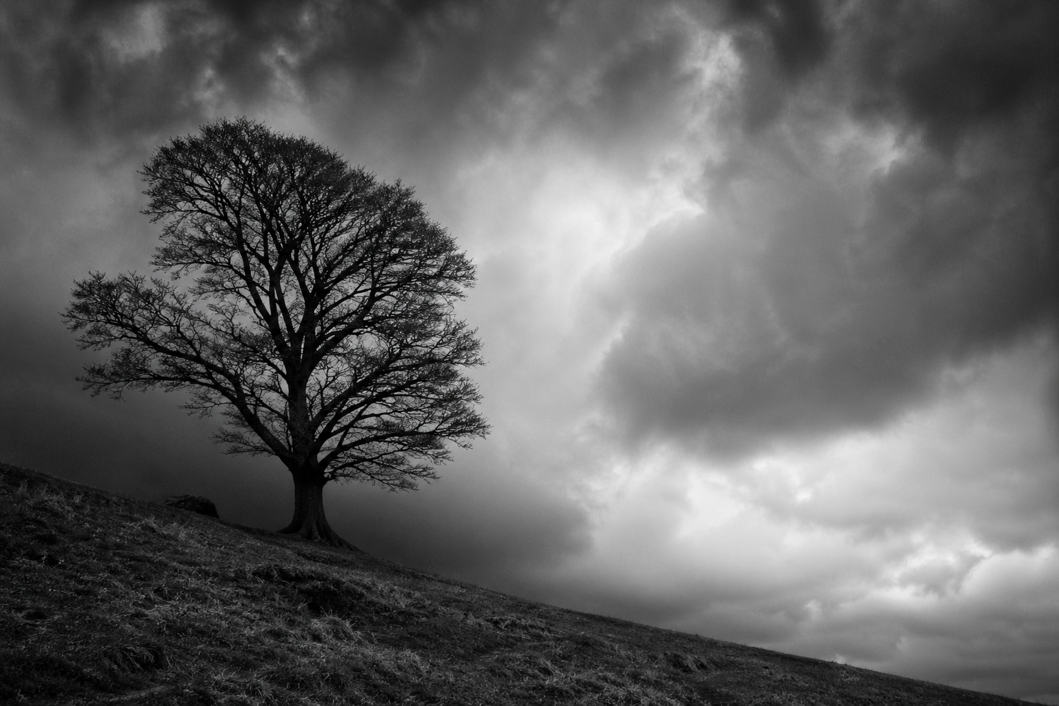
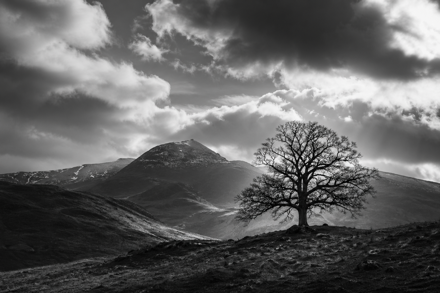
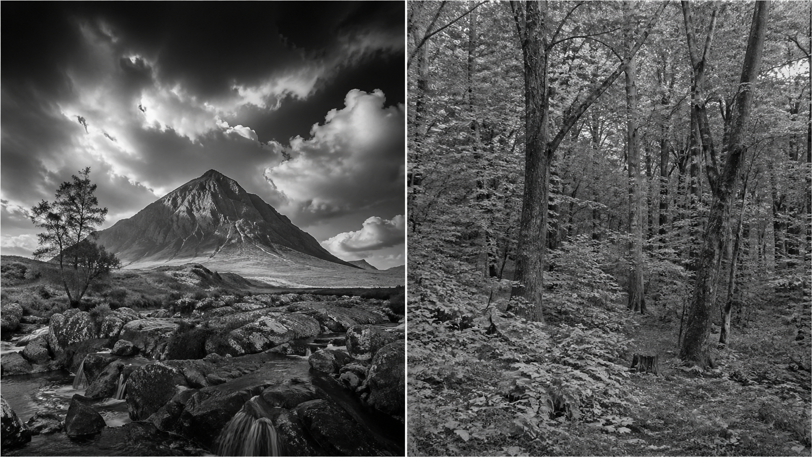
Five categories of scene reliably produce strong black-and-white work in the UK. If you find yourself shooting in any of these contexts, mono preview should be running in the back of your mind from the moment you raise the camera:
Five scene categories that reliably produce strong B&W work — when you find yourself in any of these contexts, mono preview should be running in the back of your mind.
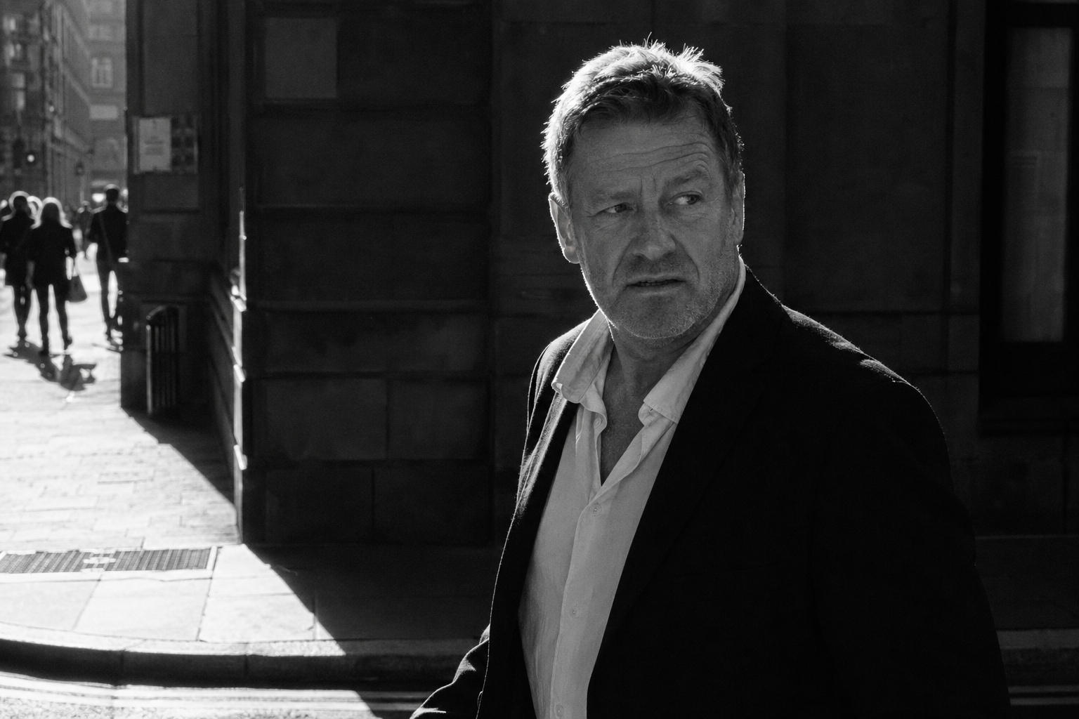
The connecting thread across all five is that the photograph's meaning lives in tone, light, shape, line, or texture — not in hue. UK street photography is the genre most associated with black-and-white for exactly this reason: the meaning of a candid frame is usually in gesture, expression, light direction and graphic structure, all of which survive desaturation untouched.
Scenes that fail in black and white
Equally important — and far less written about — are the scenes that consistently disappoint when converted. Recognising these *before* clicking saves you the disappointment of finding out in post:
Five scene categories that consistently disappoint when converted to B&W — the meaning lives in the colour itself, and removing colour removes the reason the photograph exists.
The connecting thread across the failure cases is that the photograph's meaning lives in the colour itself — the autumn leaf wouldn't be photographed if it weren't golden orange; the bluebell wood is a colour photograph by definition. Convert these and you remove the reason the photograph exists in the first place.
How to see in monochrome before you click
The hardest skill in black-and-white photography isn't conversion technique — it's pre-visualisation: training yourself to see in tones at the moment of capture rather than translating in post. Three practical approaches that all working monochrome photographers use:
Camera mono preview. Almost every modern mirrorless and DSLR has a monochrome picture profile that displays the live view and playback in black-and-white while still recording RAW in full colour. Set this as your default for any shoot where you're considering monochrome. The moment you raise the camera you see what the conversion will look like, before composing, before clicking. This is the single most powerful pre-visualisation aid available, and it's free. Nigel Danson, Mark Littlejohn, Joe Cornish and almost every working UK landscape photographer who shoots monochrome uses this approach.
The squint test. Look at the scene with your eyes half-closed. Squinting reduces colour information and amplifies tonal contrast — what you see is roughly what the monochrome conversion will look like. If the scene becomes more graphic and powerful when you squint, it'll likely convert well. If it becomes muddy and uniform, it probably won't.
The contrast test. Identify the brightest area and the darkest area in your composition. If there's strong tonal separation between them — bright sky against dark land, hard sunlight against deep shadow, a white subject against a dark background — the scene has the contrast skeleton that B&W needs. If everything in the frame sits in the mid-tone zone (the typical English overcast green-grey woodland), there's no skeleton to build a B&W image around.
The three-question decision framework
Three questions to ask before converting any frame. If you can answer "yes" to at least one of them with conviction, conversion will probably help. If you have to reach for a "yes", the frame is likely better in colour.
See a UK photographer working in black and white
The video below — "Why I shot just B&W to IMPROVE my PHOTOGRAPHY" by Nigel Danson on the Nigel Danson channel — is filmed on location in Snowdonia, Wales, and is unusual in that it's specifically about the *discipline* of restricting yourself to monochrome as a way to improve your overall photography. Nigel works through compositions thinking only in tones, light, and shape — exactly the pre-visualisation skill this article centres on. About 10 minutes and worth watching before your next session where you intend to shoot deliberately in monochrome.
Common black-and-white mistakes
Converting in post as a default rather than a choice. If most of your "best" frames came out as B&W conversions, you're probably hiding weak colour work behind a B&W treatment. Strong photographers convert specific frames for specific reasons, not whole shoots out of habit.
Maxing out clarity and contrast in conversion. The harsh, crunchy, over-clarified B&W look is the modern equivalent of HDR overcooking — it dates a photograph more than any colour grading would. Hold contrast and clarity back; let the tonal structure of the original scene do the work.
Ignoring colour-channel sliders in conversion. The default Lightroom or Capture One B&W conversion is just desaturation. Every conversion benefits from adjusting individual colour channels (red, orange, yellow, green, blue, purple) — darkening blue makes skies dramatic, darkening green makes foliage richer, lightening orange and red flatters skin tones. The channel sliders are where conversion becomes craft.
Shooting only in monochrome mode. Set the camera to display monochrome but record RAW in colour — the colour information is needed for the channel slider work in post. Shooting JPEG-only in monochrome locks you out of that flexibility.
Forcing conversion on a scene that doesn't want it. If you've spent twenty minutes trying to make a frame work in B&W and it's not landing, the frame is telling you it's a colour photograph. Listen to it. Some of your best work will be colour, some will be monochrome, and some will work in both — but very few photographs work in both equally well.
Treating B&W as one style. "Black and white" covers everything from low-key brooding silver gelatin to high-key minimalist contemporary, from grainy street reportage to creamy fine-art landscape. Knowing which sub-style your frame wants is part of the decision, not an after-thought.
Black and white photography FAQ
Key takeaways
B&W is a choice, not a rescue — frames that fail in colour usually fail in monochrome too.
Four creative reasons to convert — subject simplification, tonal drama, timelessness, or when colour is fighting the photograph. If none applies, leave it in colour.
Five scenes that work — high contrast, strong shape and line, texture-led, sky-dominant cloud drama, atmospheric weather. Five that fail — autumn foliage, flowers, sunsets, low-contrast pastels, hue-dependent meaning.
Pre-visualise in monochrome before clicking — camera mono preview, squint test, contrast test. The skill that separates deliberate B&W work from desaturation-after-the-fact.
Three-question decision framework — does removing colour add power, is colour fighting the photograph, would the photograph still mean what it means without hue? Yes to one with conviction = convert.
Hold contrast and clarity back in conversion — the over-crunchy modern B&W look dates a photograph faster than any colour treatment.
Use the colour-channel sliders — the default desaturation is the worst version of B&W conversion. Channel work is where craft lives.
Continue learning
Conclusion and summary
Black-and-white photography rewards deliberate decision-making more than any other tonal choice in photography. The technical conversion has been thoroughly solved — your camera, Lightroom, Capture One and the Nik Silver Efex plugin will all produce technically competent monochrome from any RAW file. What separates strong B&W work from weak B&W work is the decision *whether to convert at all*, made early — ideally at the moment of capture, with mono preview running in the camera and the squint test in your head. Photographers who convert deliberately, for one of the four creative reasons, in scenes that genuinely benefit, produce monochrome work that endures. Photographers who convert as a habit or a rescue produce work that looks like everyone else's converted habit-and-rescue work.
The framework to internalise: convert for one of four reasons (subject simplification, tonal drama, timelessness, when colour is fighting the photograph), in scenes that survive desaturation (tonal contrast, shape, line, texture, atmospheric drama), avoiding scenes whose meaning depends on colour (autumn foliage, flowers, sunsets, low-contrast pastels). Pre-visualise in monochrome with camera preview and the squint test. Use channel sliders in conversion, not default desaturation. Hold contrast and clarity back. The strongest photograph you take this year will be the one you knew was a B&W image before you raised the camera, not the one you turned monochrome in post when colour didn't quite work.
If you'd like to develop this seeing under a structured programme, my two-week Black & White Photography Course in Coventry covers the visual building blocks of B&W with practical exercises, plus how to recognise B&W opportunities in the field rather than only in post. The course is designed for beginners and intermediate photographers who want to move from occasional desaturation to deliberate monochrome practice. For everything else, the framework above plus your camera's mono preview switched on for one full shoot is a strong starting point — try a week of seeing only in tones and you'll be a better photographer in colour as well as in monochrome.